Ceramics Ink Series
Packaging, branding, MARKETING and product design for a fountain pen ink series by Yoseka Stationery, PRODUCED BY INK INSTITUTE IN TAIWAN, in collaboration with ceramic artist Li Yanxun
PROJECT INFO
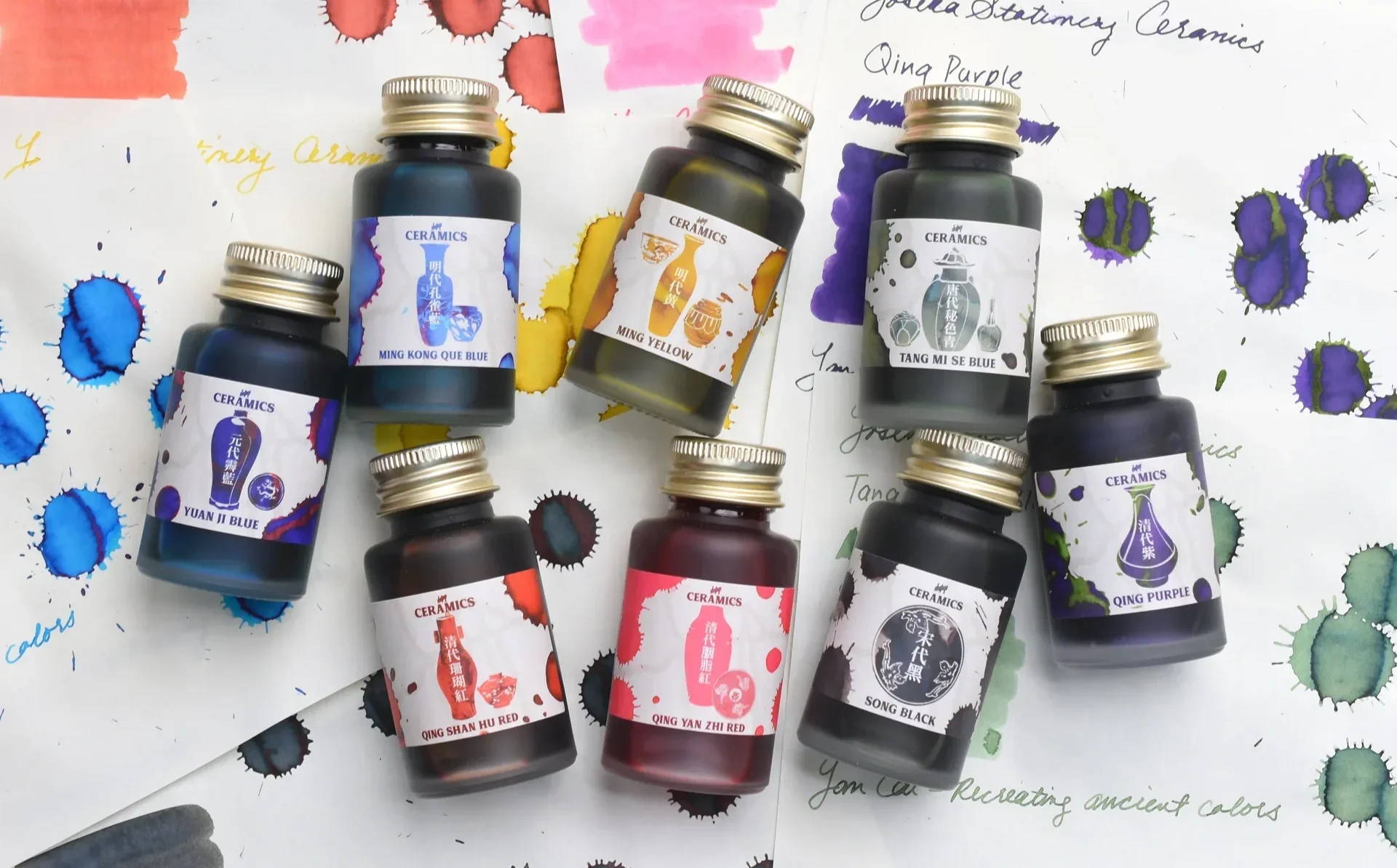
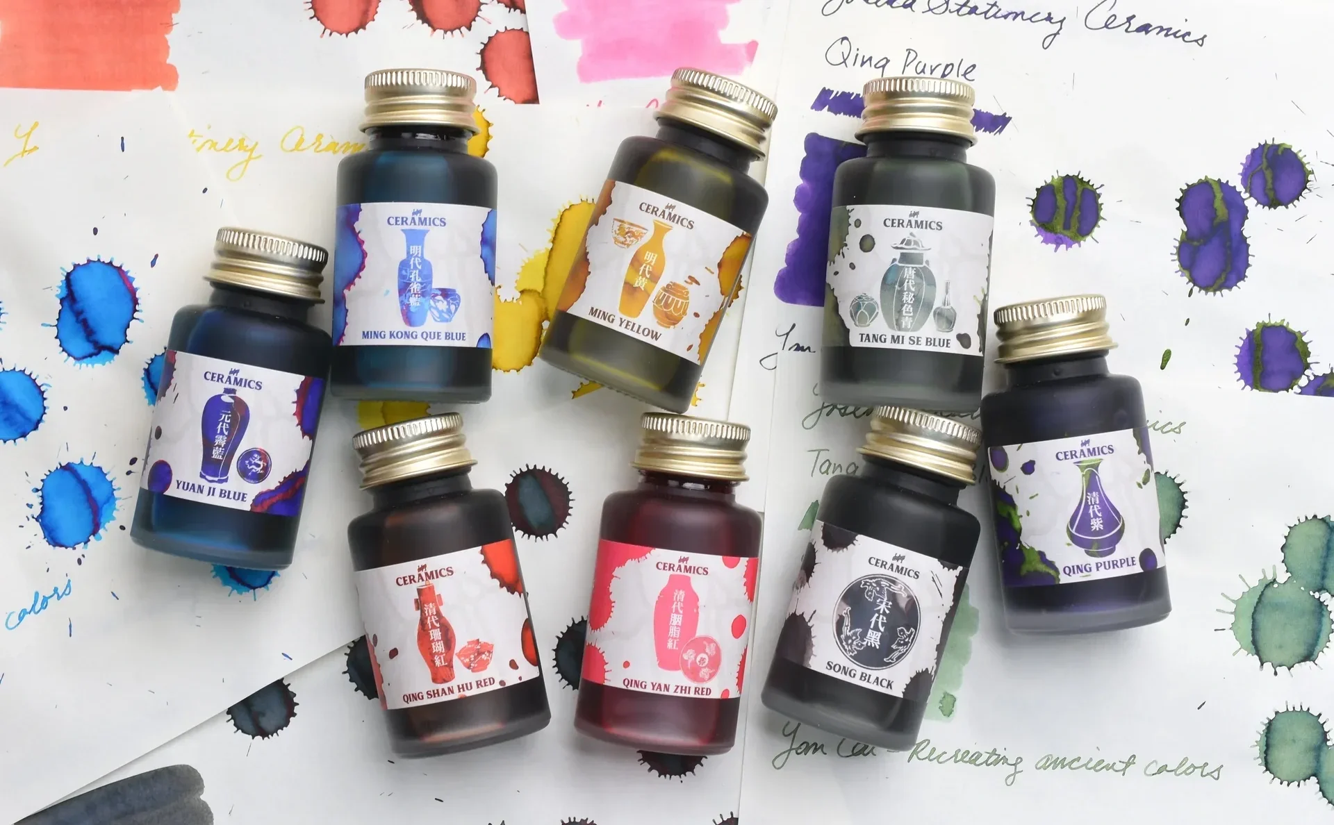
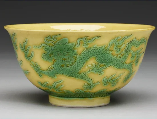
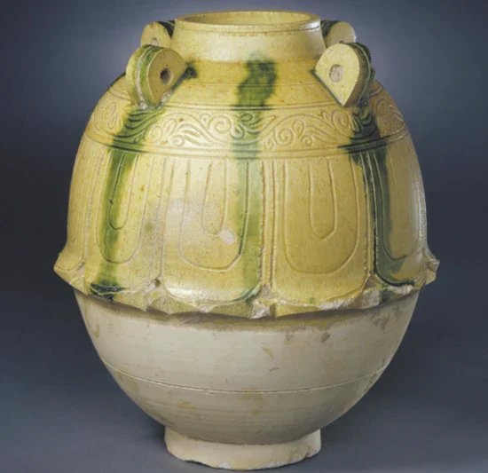
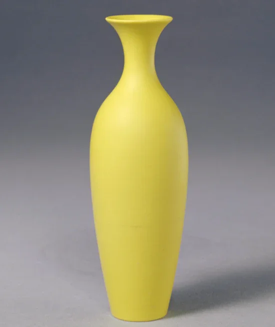
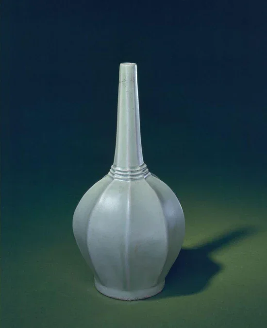
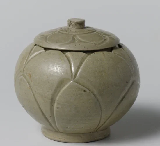
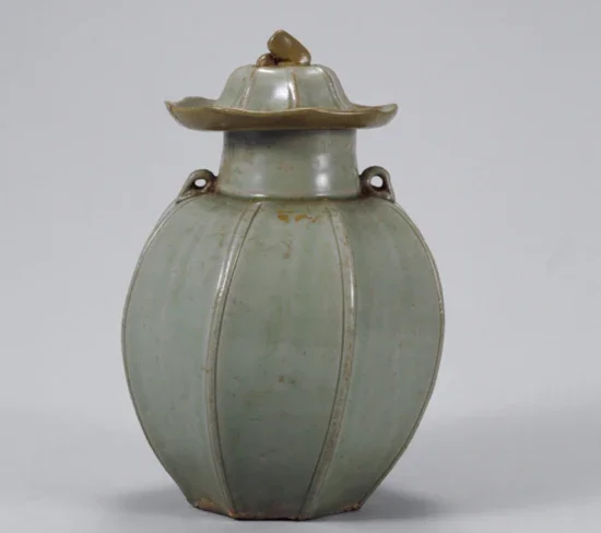
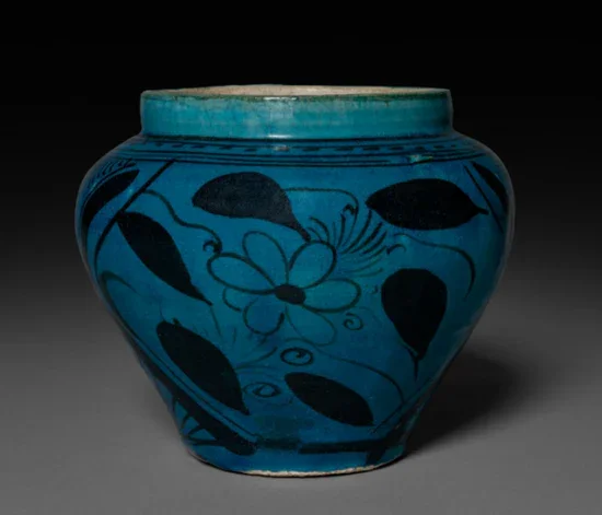
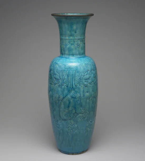
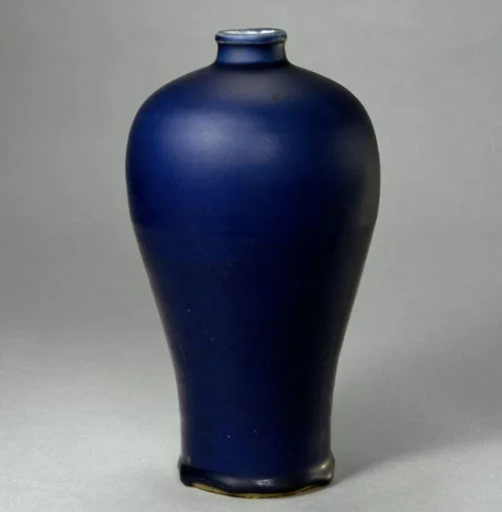
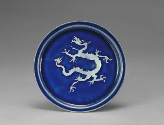
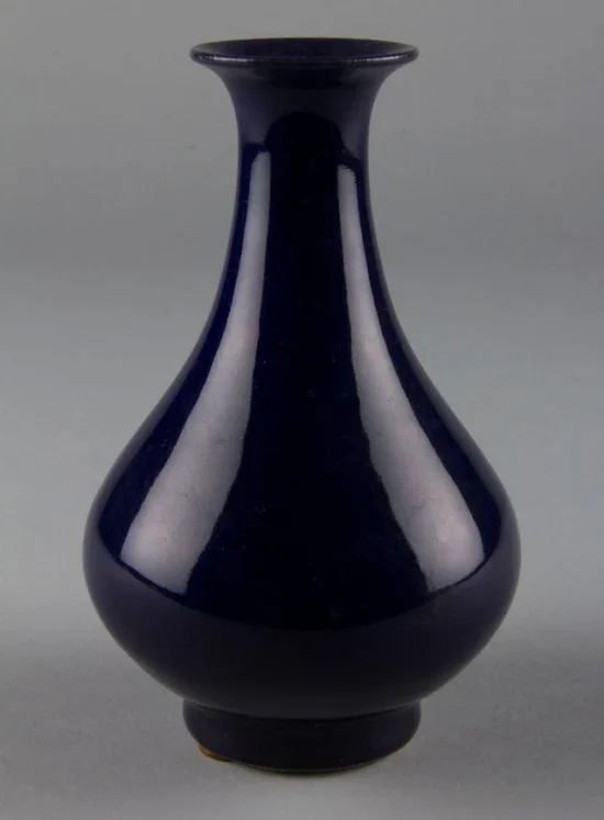
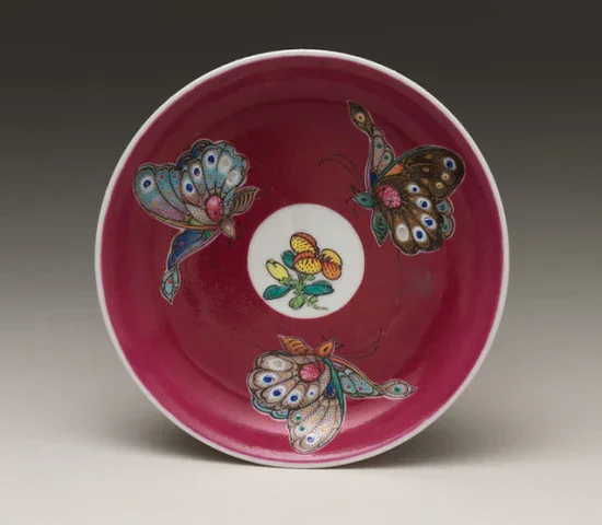
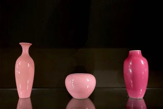
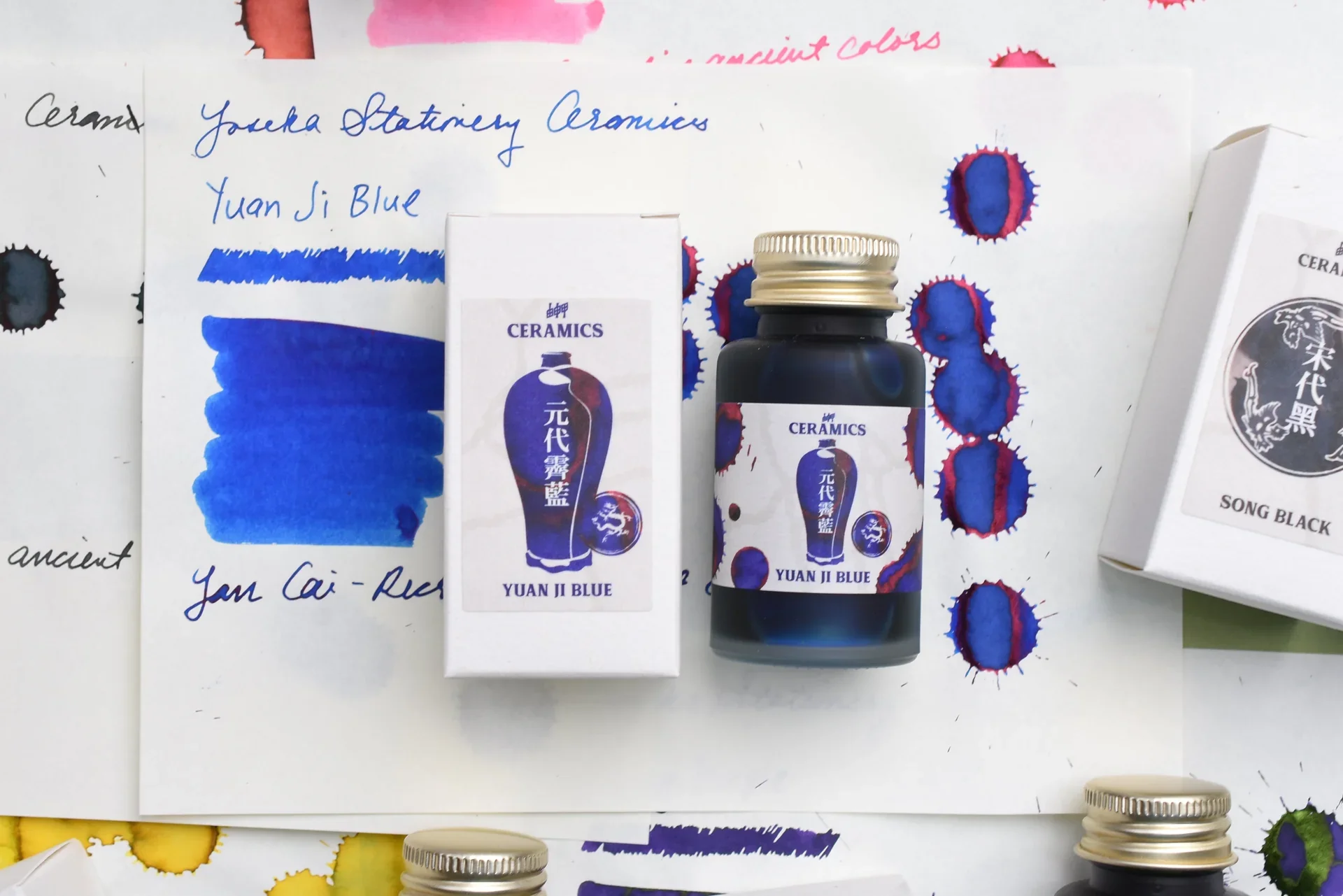
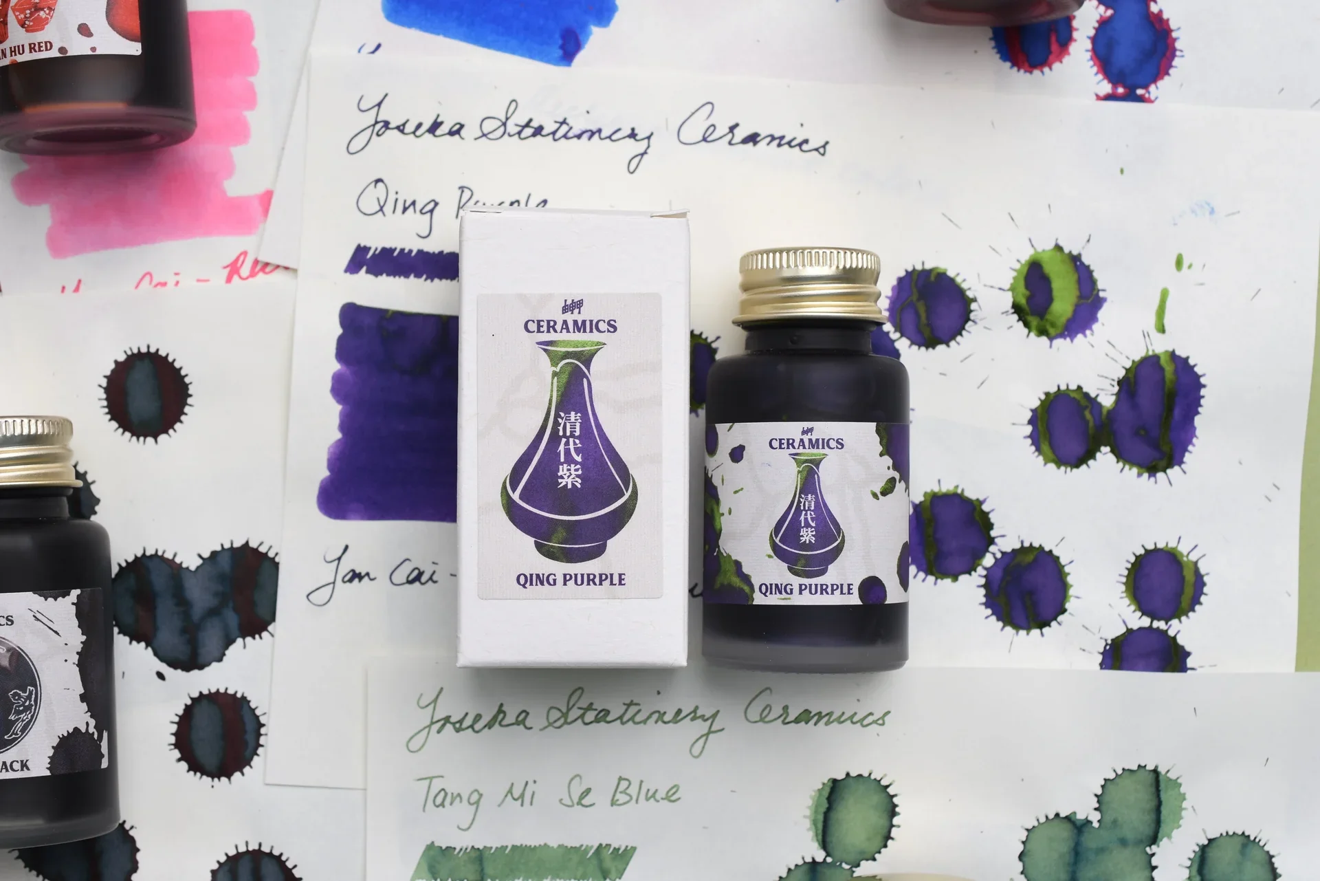
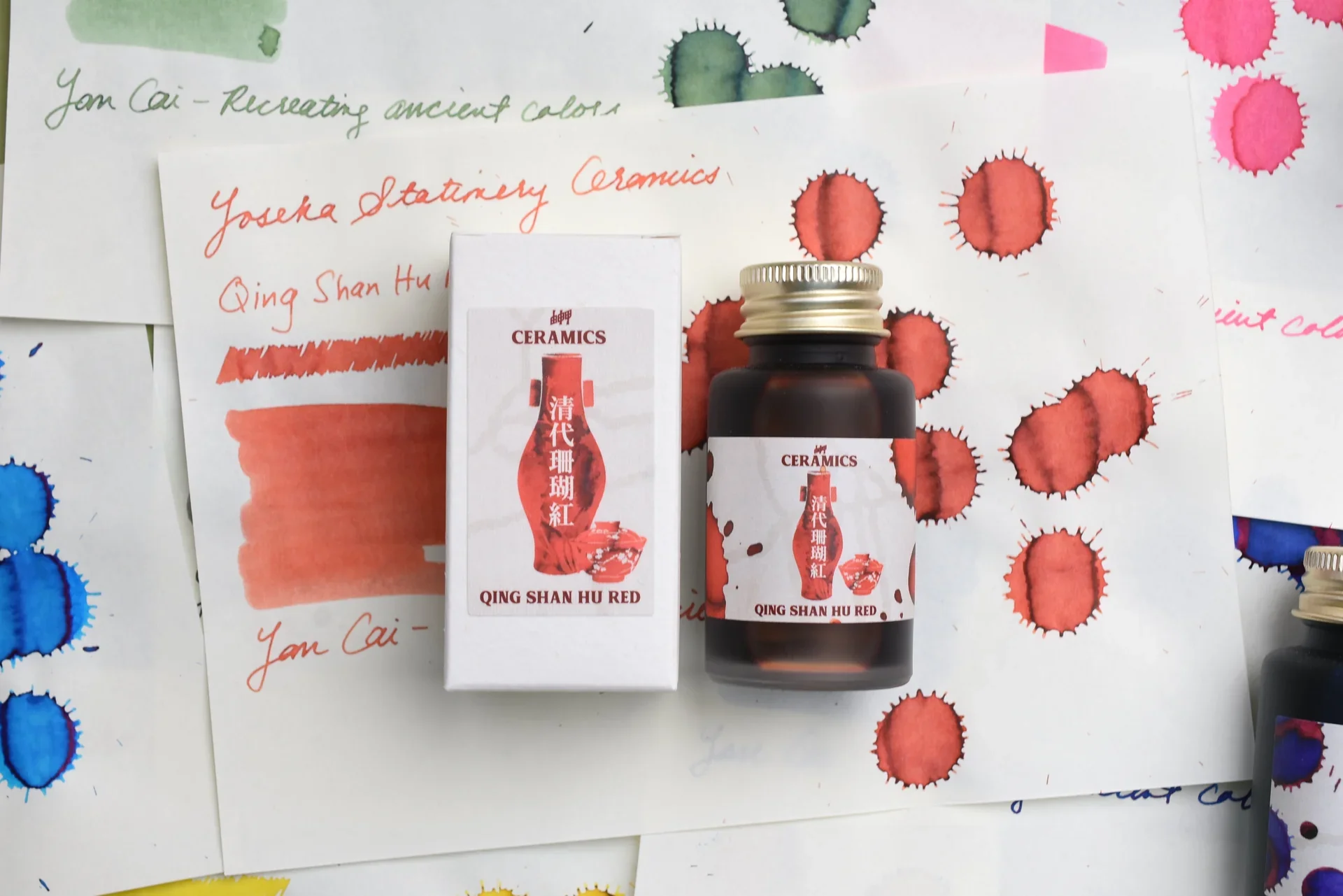
The Yoseka Ceramics Ink Series was a project created to produce a line of fountain pen inks while highlighting a prominent portion of East Asian history. Yoseka and artist Li selected 8 colors from Li’s Yan Cai color project, in which he used chemical experimentation to revive the formulas of over 60 historical glazes. The ceramic glazes come from the Yuan, Ming, Tang, Qing, and Song Dynasties, spanning 10 centuries of Chinese color and history. To create these inks, each color received its own special treatment, requiring historical research, ink color prototyping with Ink Institute’s factory, testing at Yoseka’s studio, feedback from fountain pen users, and packaging design by Ashley Womack.
CREATING THE PRODUCT IMAGERY
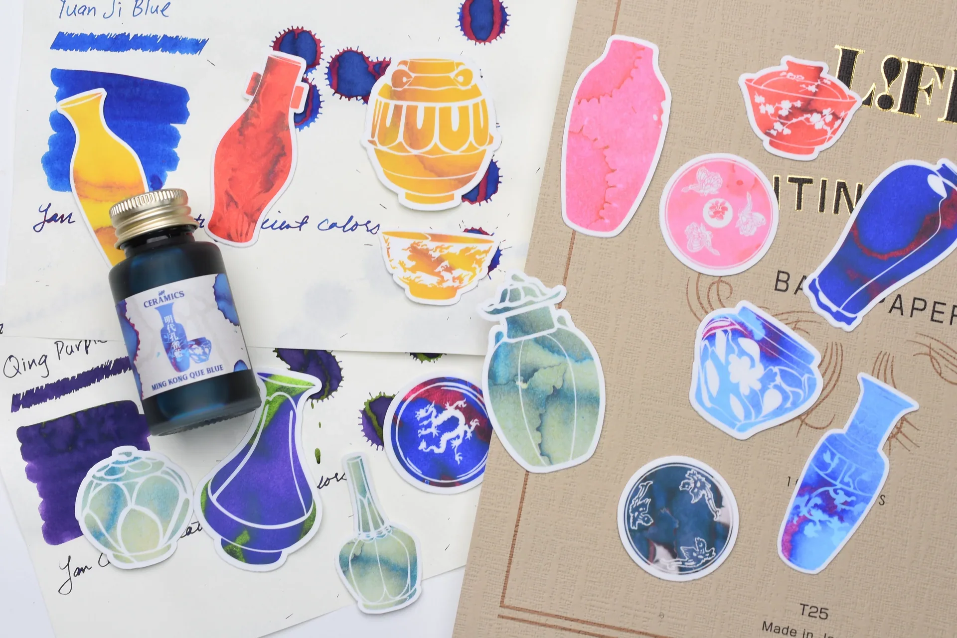
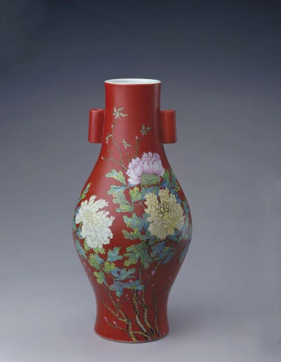
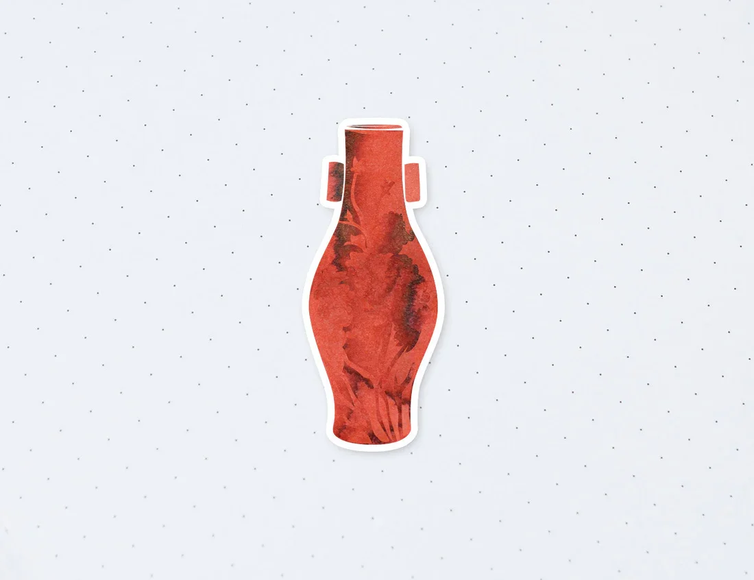
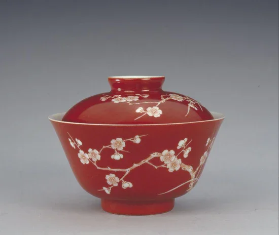
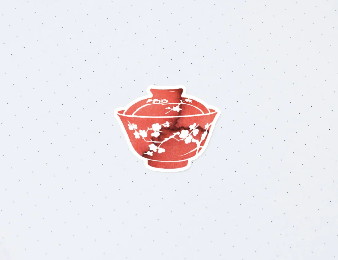
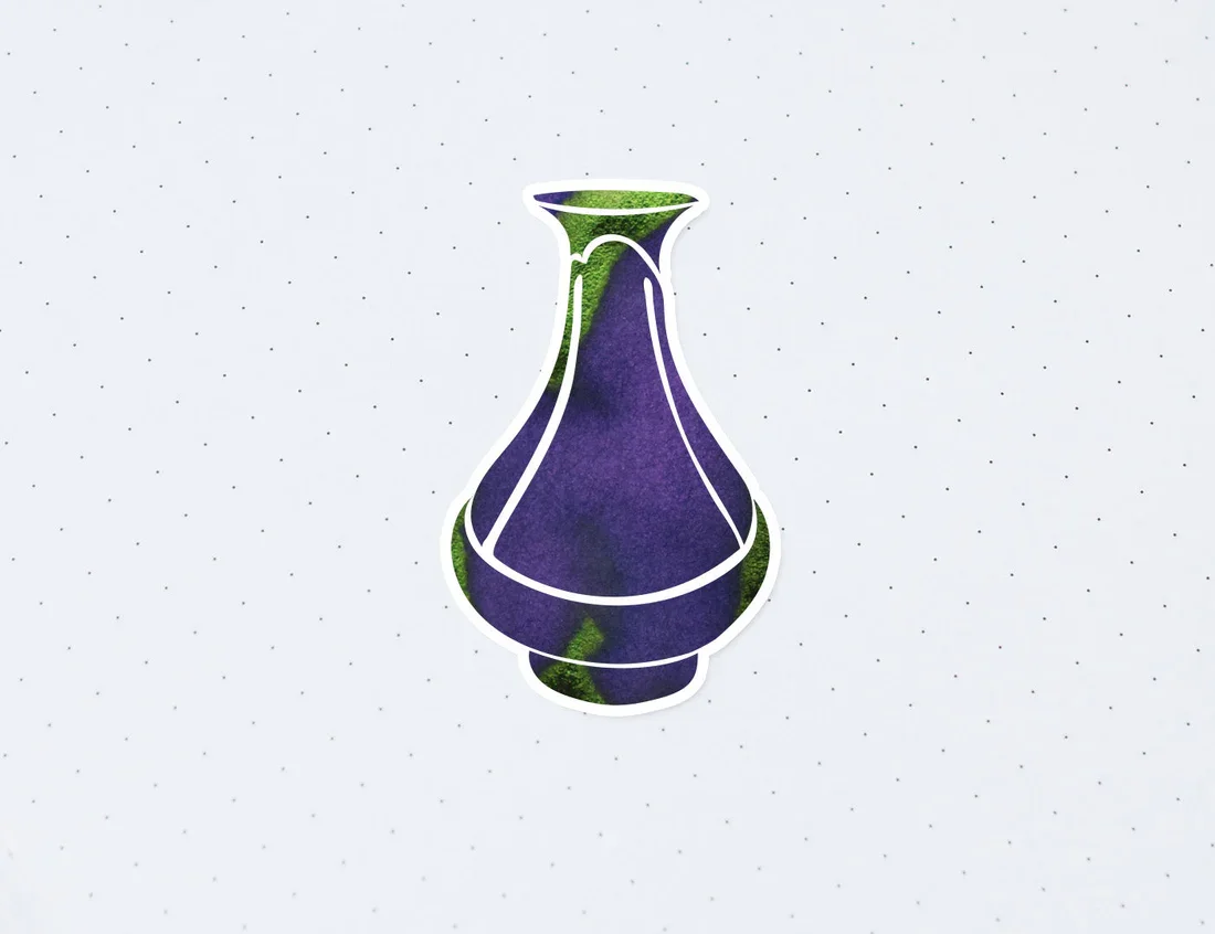
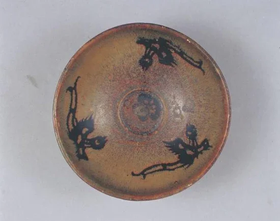
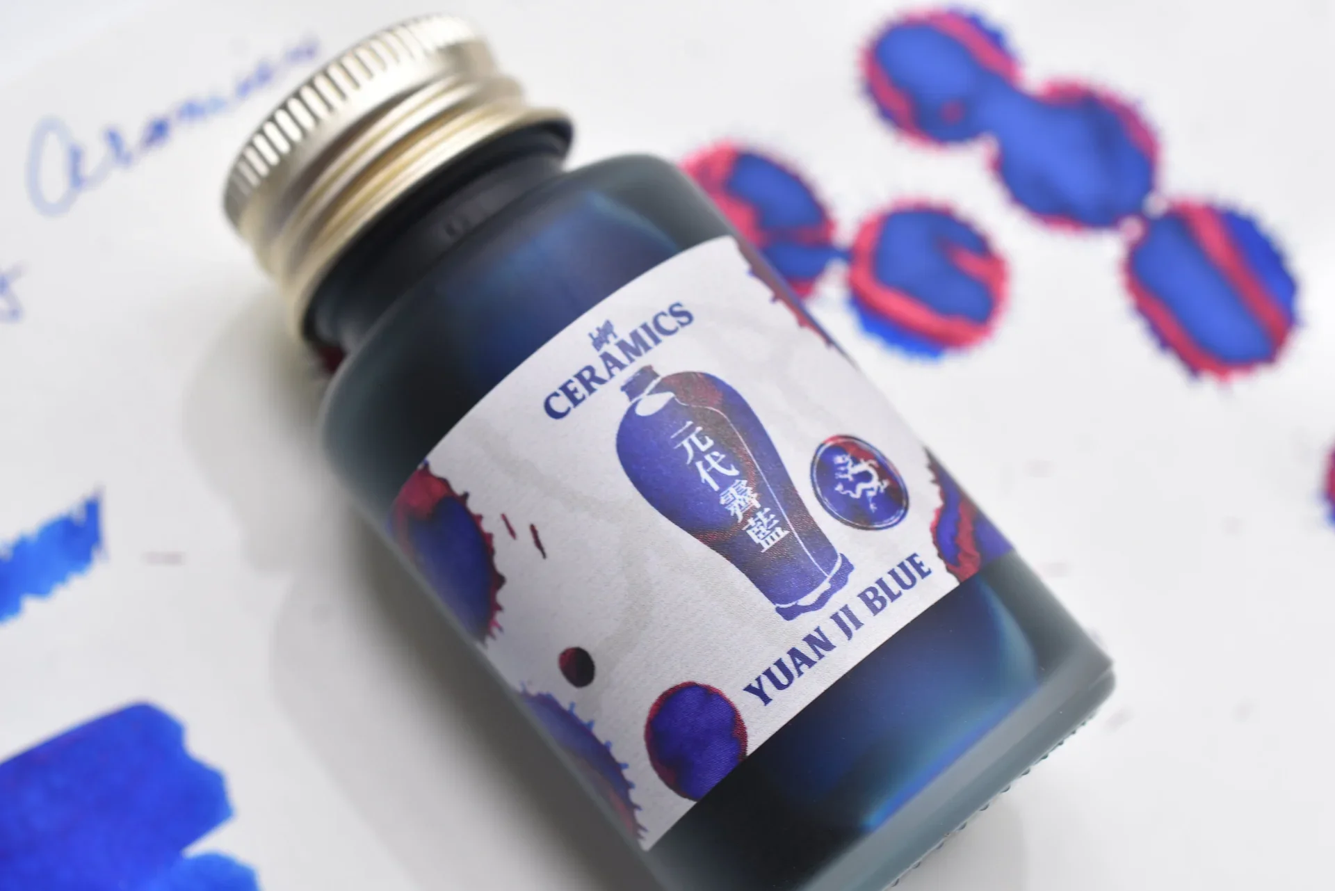
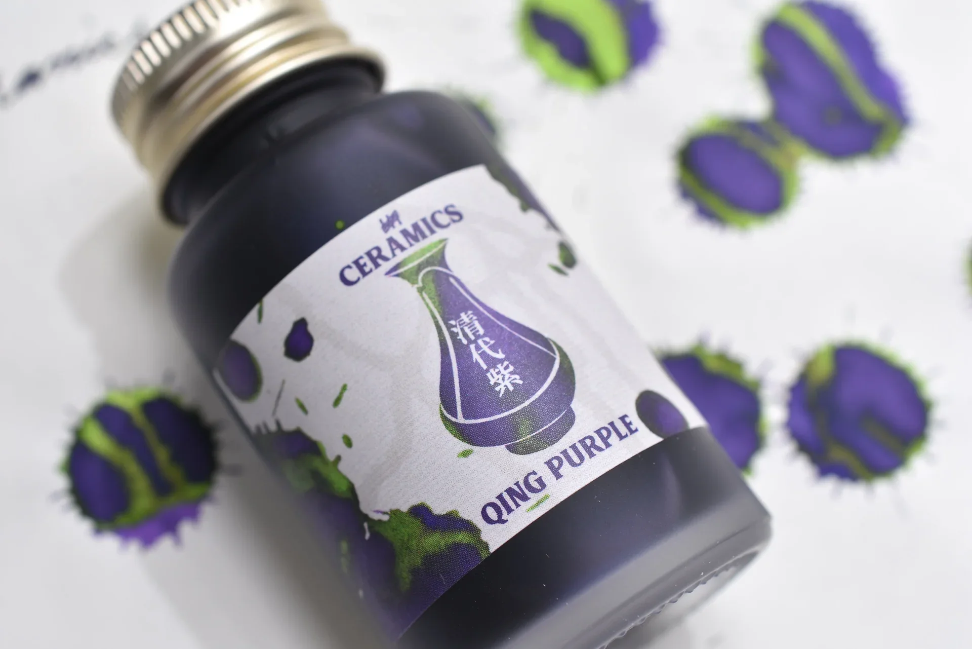
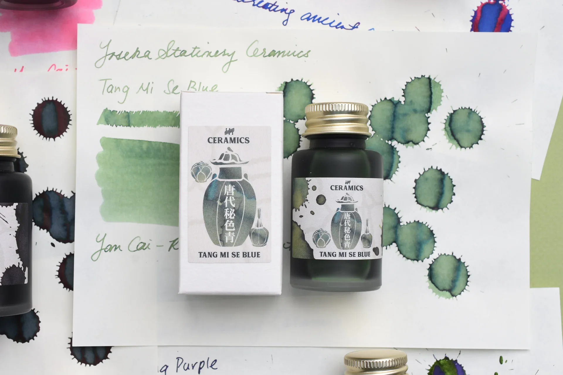
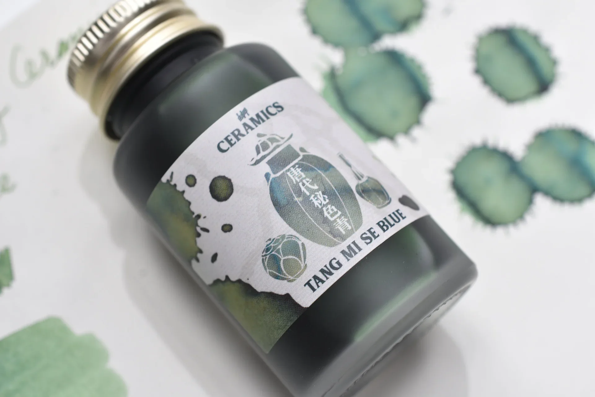
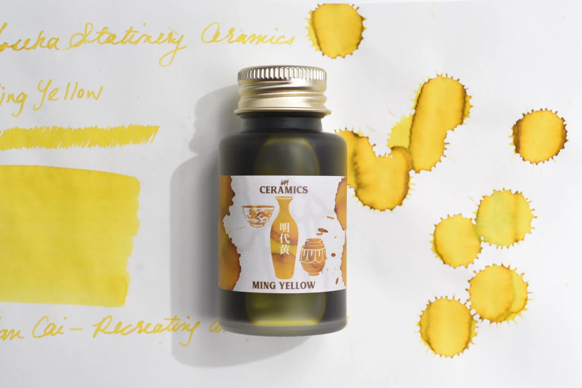
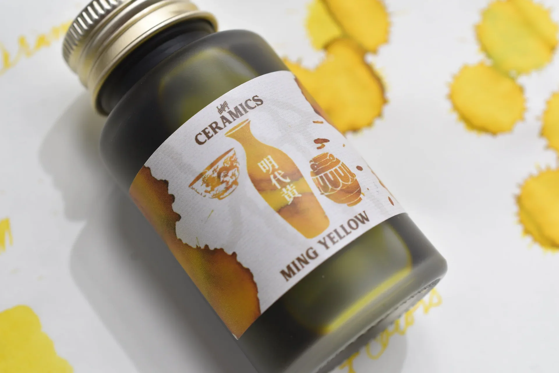
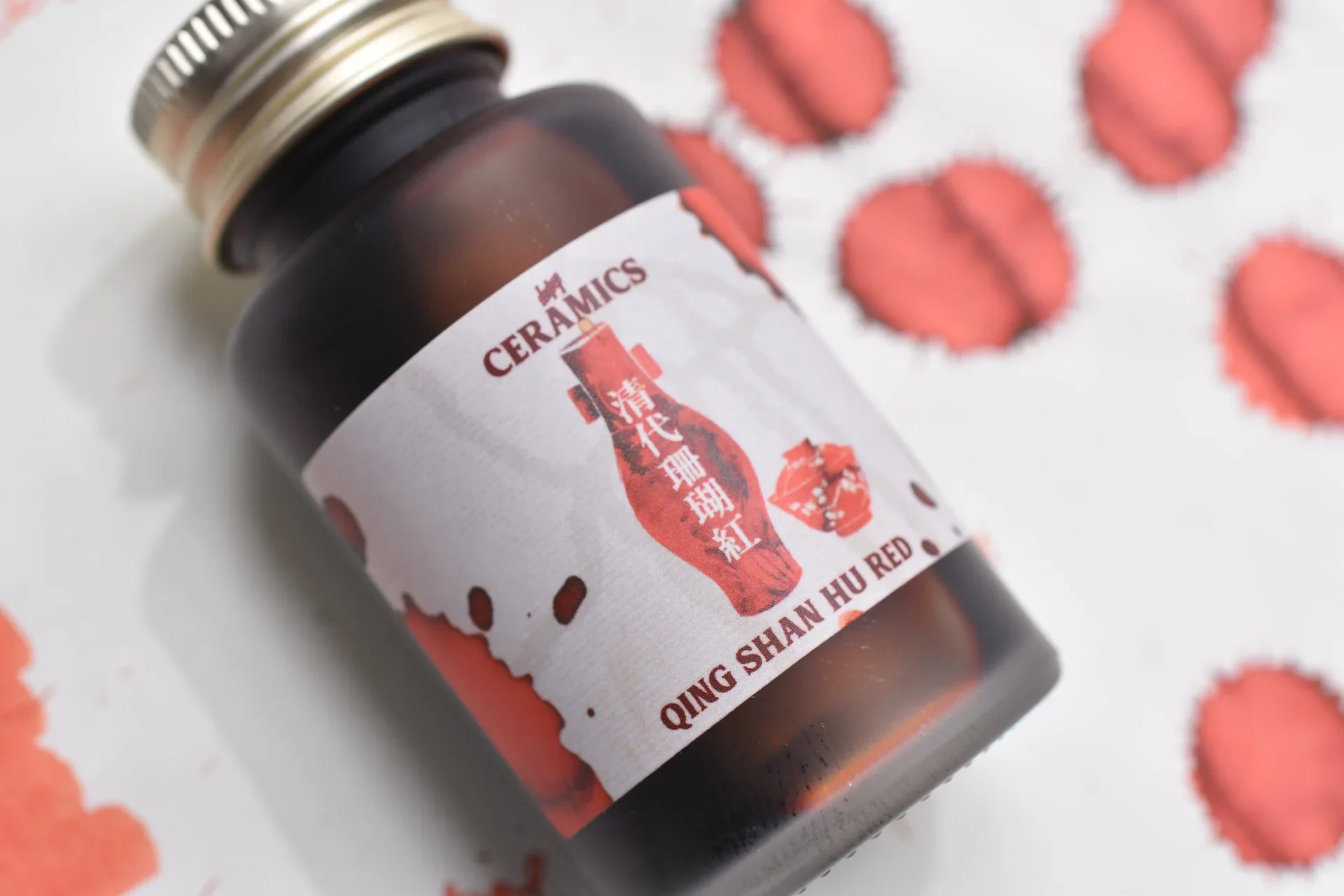
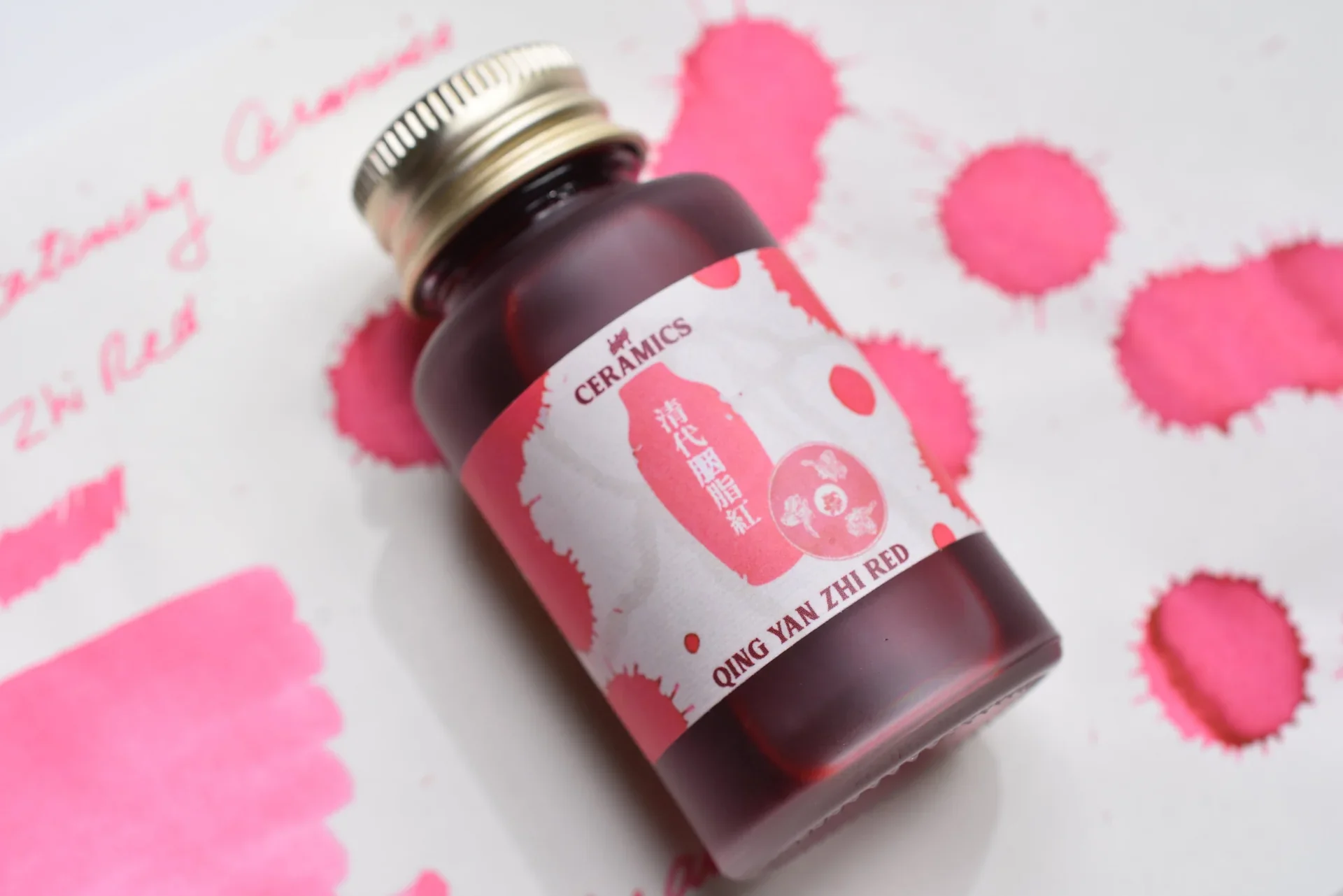
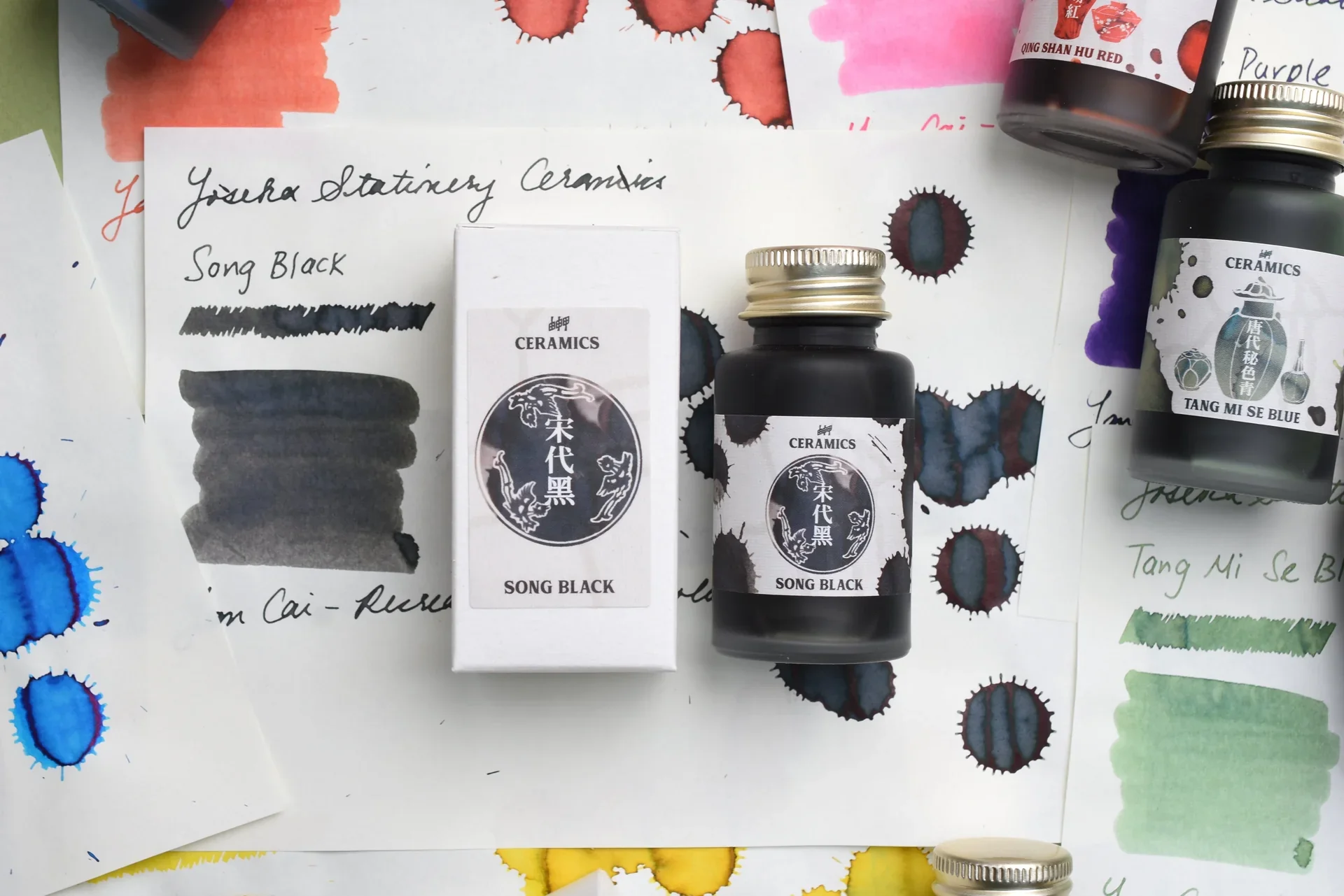
Each color was inspired by a ceramic piece that has artifacts stored in various museums around the world. I translated these ceramics into digitized vector illustrations using mixed media — I painted the inks traditionally onto paper, scanned the paintings into Adobe Illustrator, created digital silhouette illustrations of each ceramic piece, than collaged the paintings to mimic the qualities of each ceramic’s individual glaze.
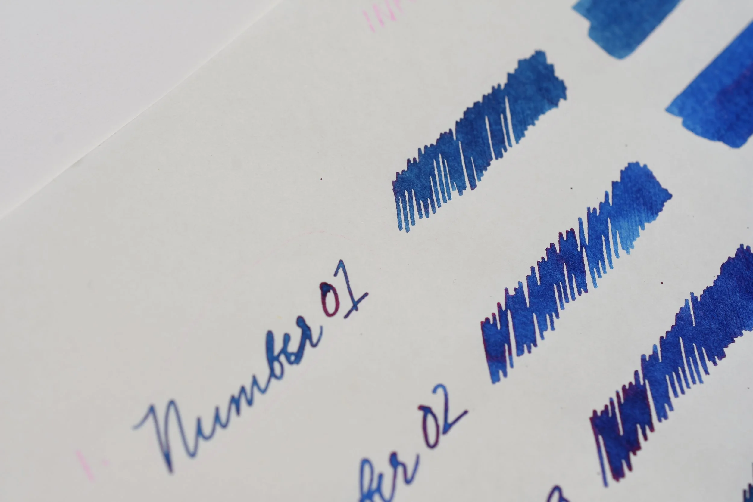
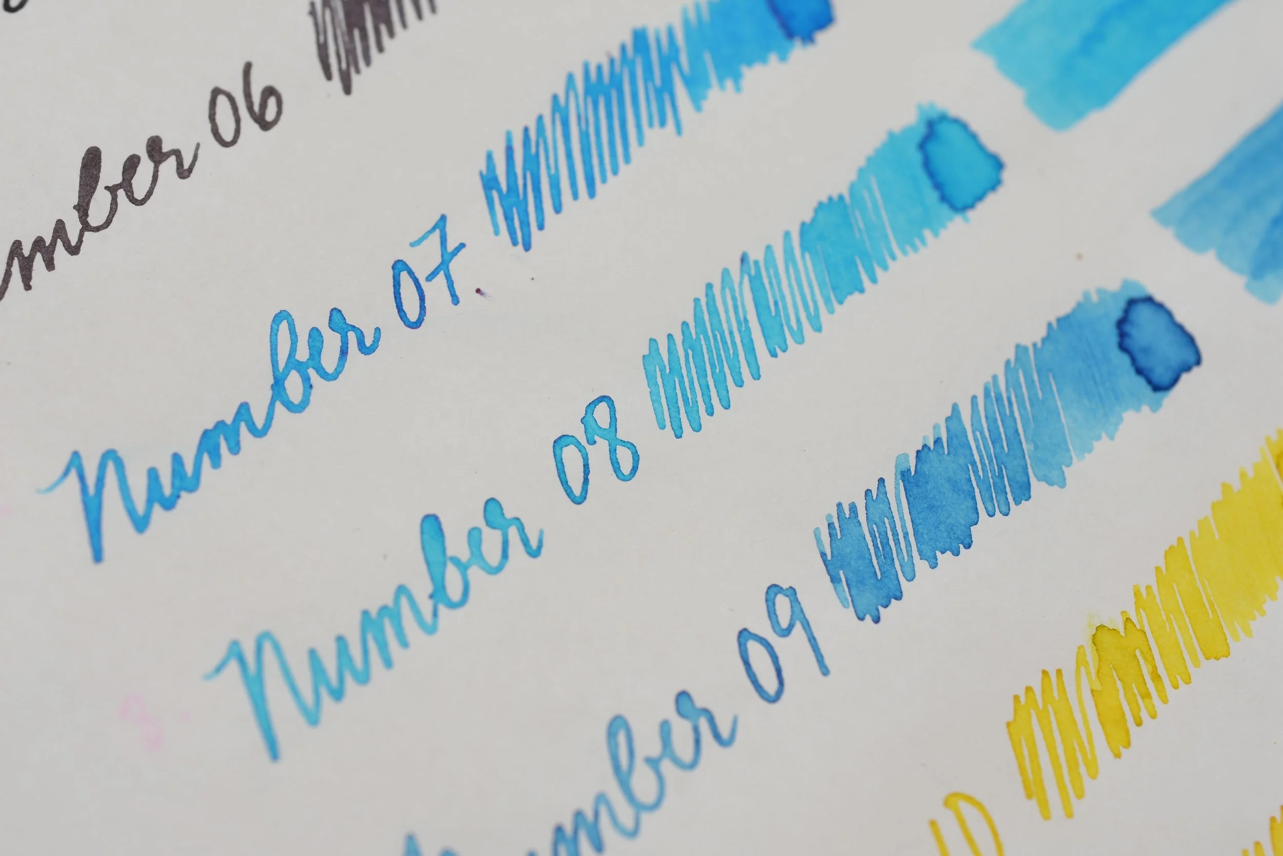
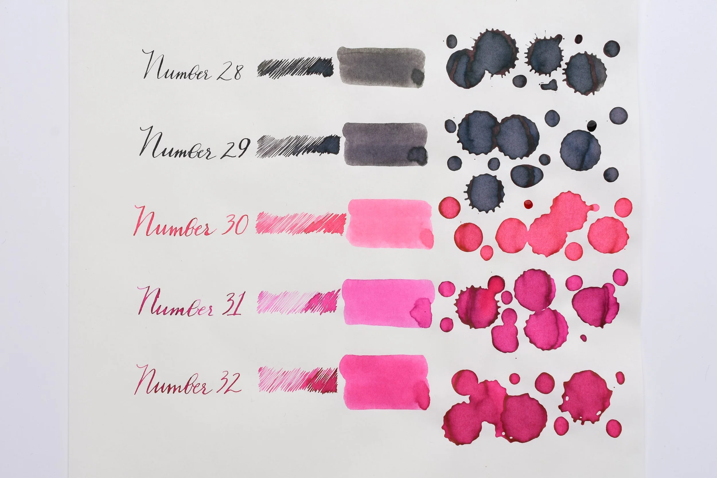
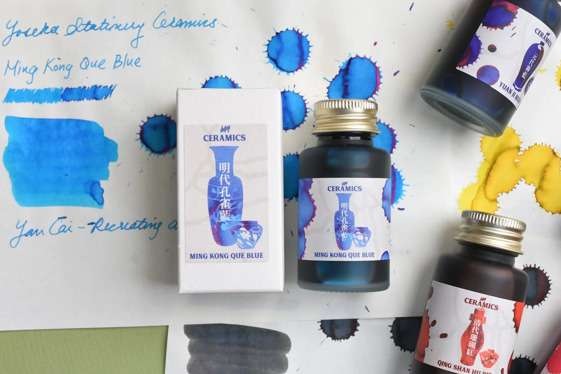
I swatched each ink in various methods to showcase as many qualities of the ink as possible—when it’s spread thin, thick, and how it looks in writing. Each ink was selected by Li Yanxun for its historical accuracy to the corresponding glaze color.
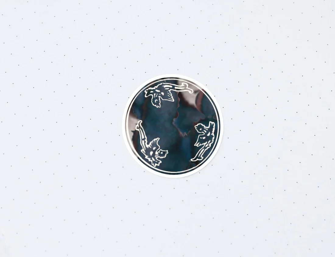
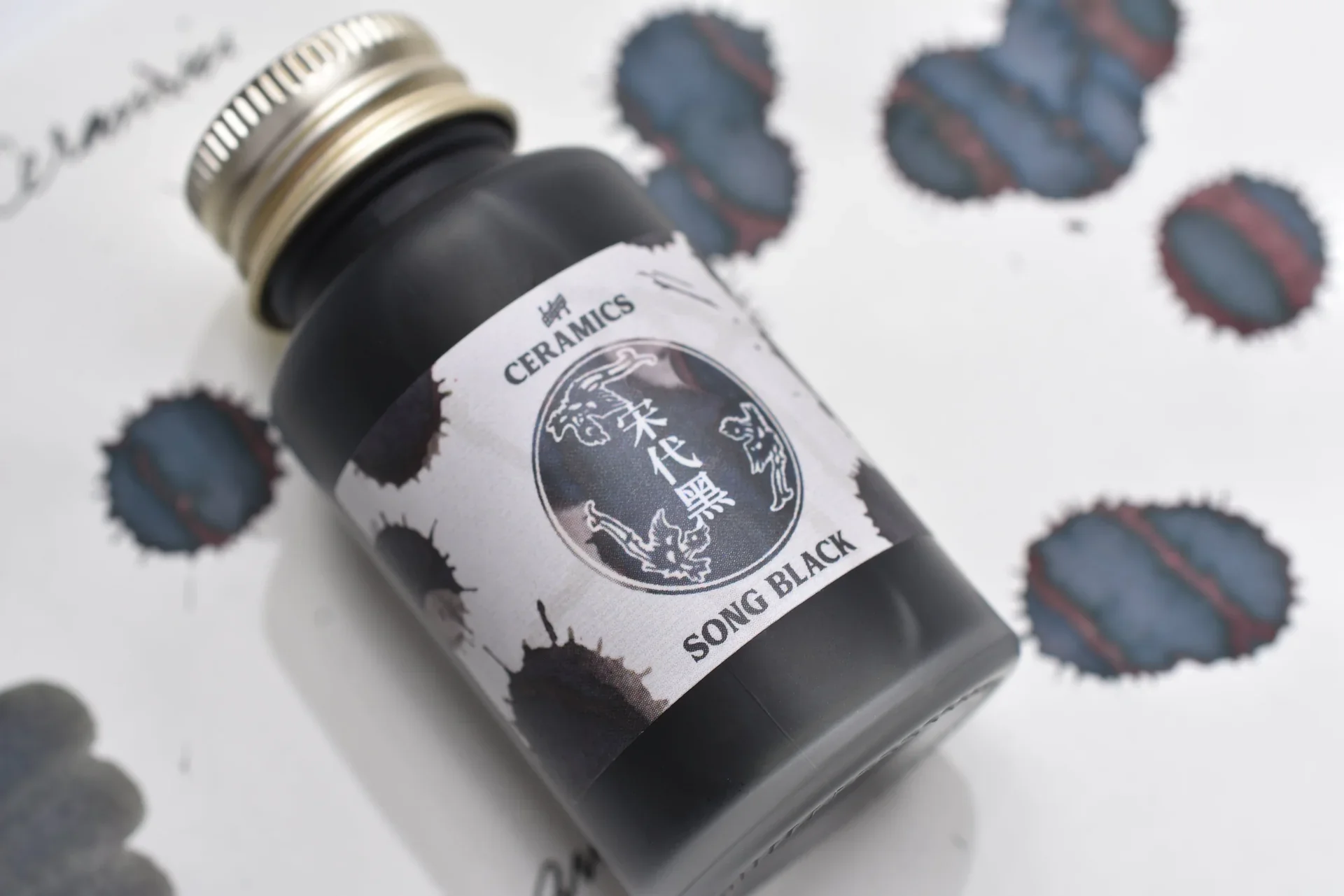
I swatched the final ink selections by dropping them from a height with a syringe. This created energetic splatter patterns I could later use for digital collage.
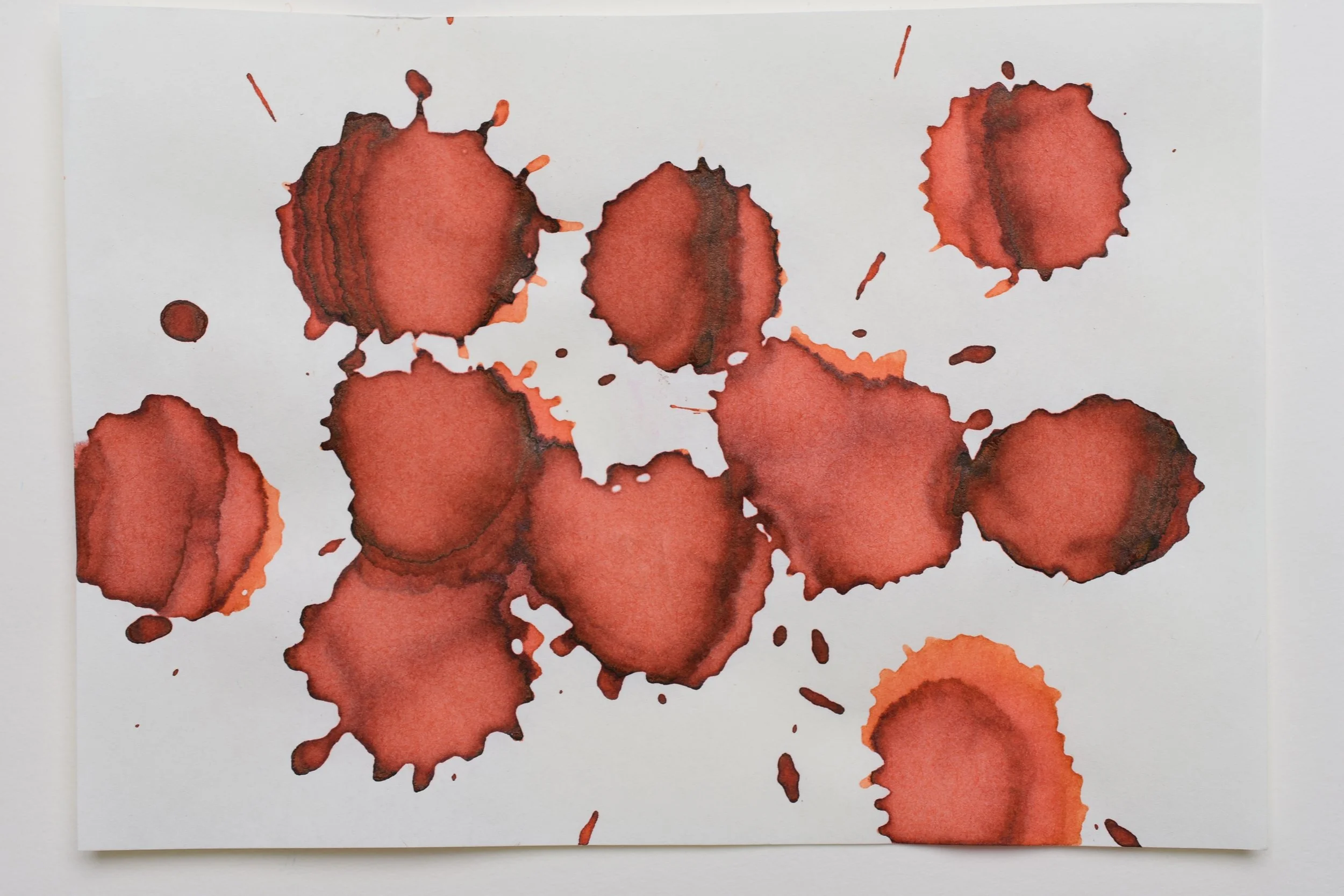
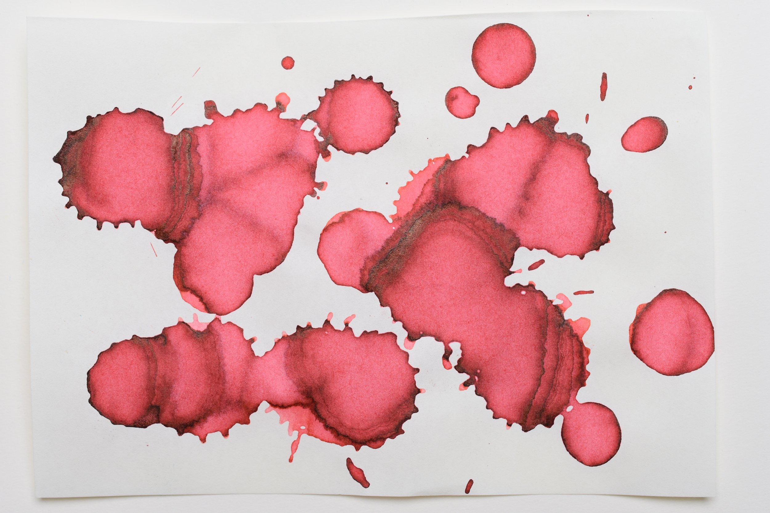
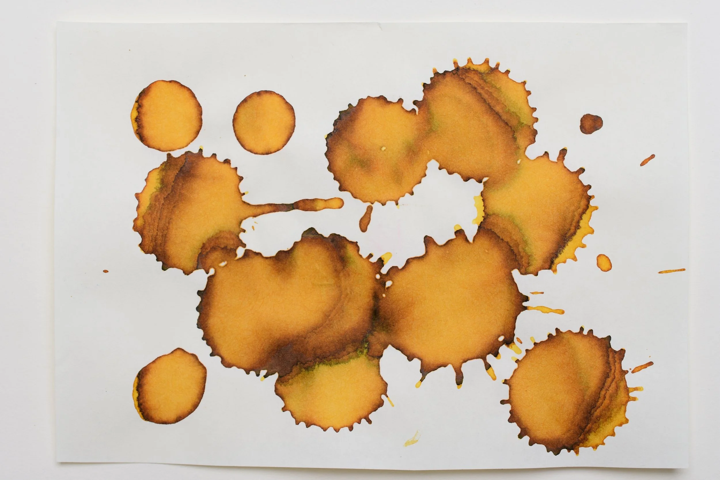
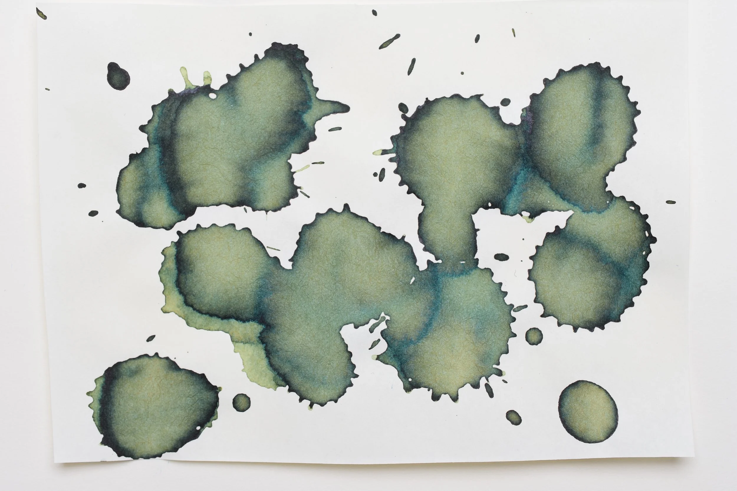
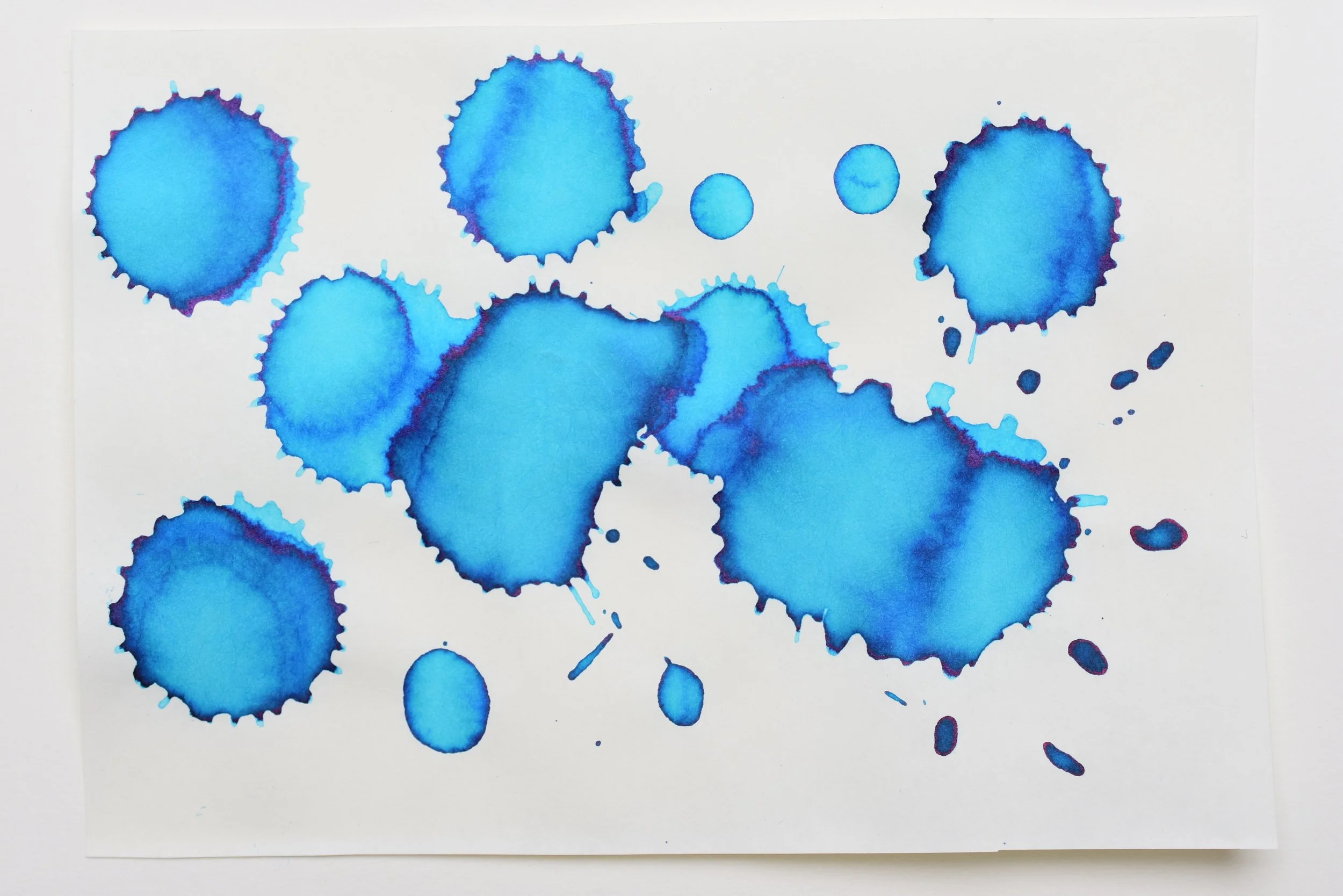

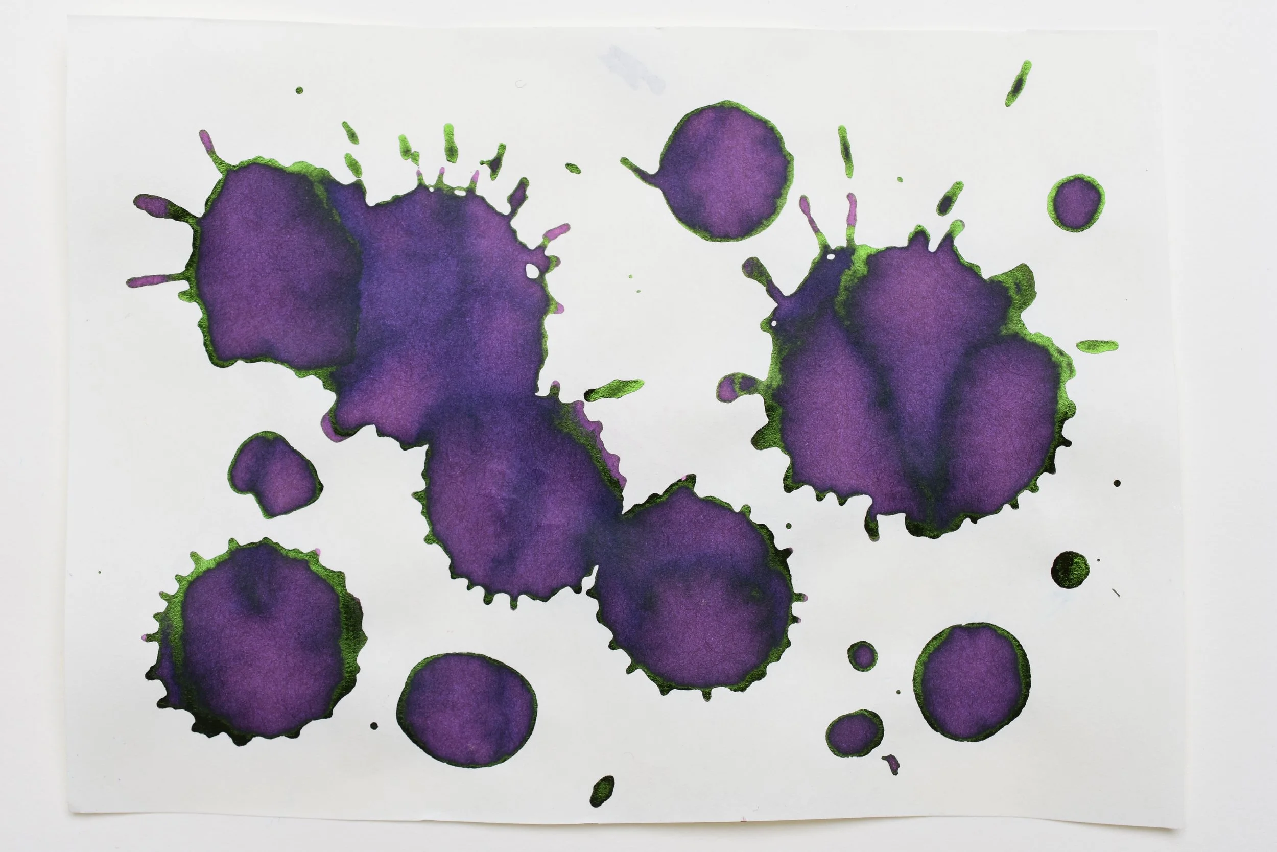
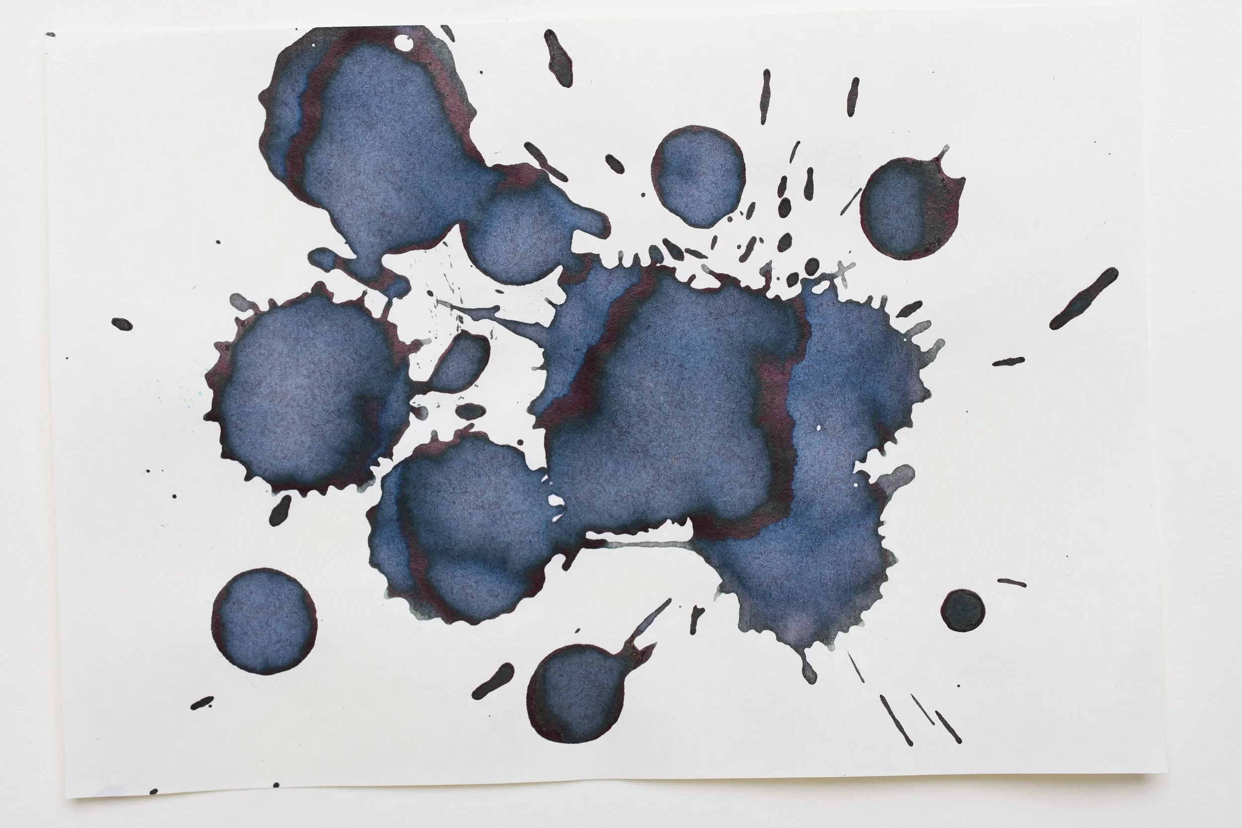
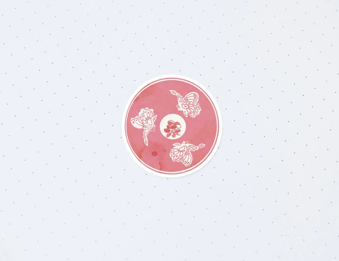
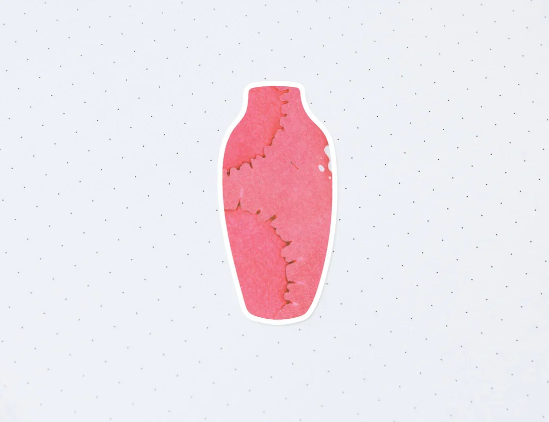
I created silhouette illustrations of each ceramic piece, then collaged the ink splatters to provide color and shadow to mimic the qualities of each ceramic’s individual glaze.


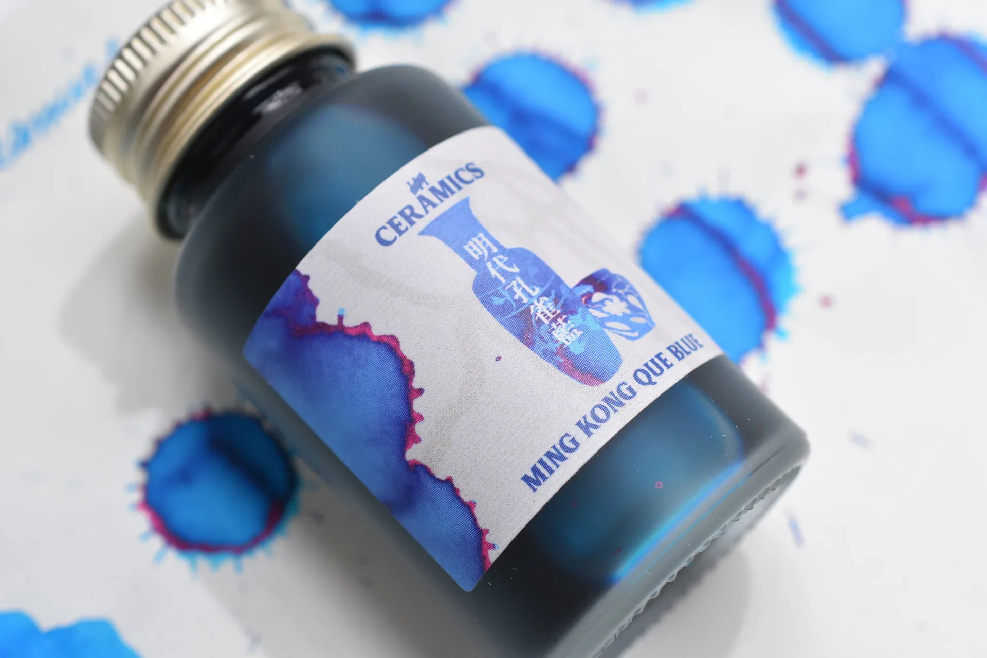
Using Ink Institute’s label printing specifications, I designed the outer packaging labels and the individual ink bottle labels. With my linguistic background and knowledge of Chinese characters, I paid careful attention to the multilingual graphic design formatting—balancing the English and Chinese text to keep both legible for customers who may be native speakers of either language.
SUpporting marketing materials
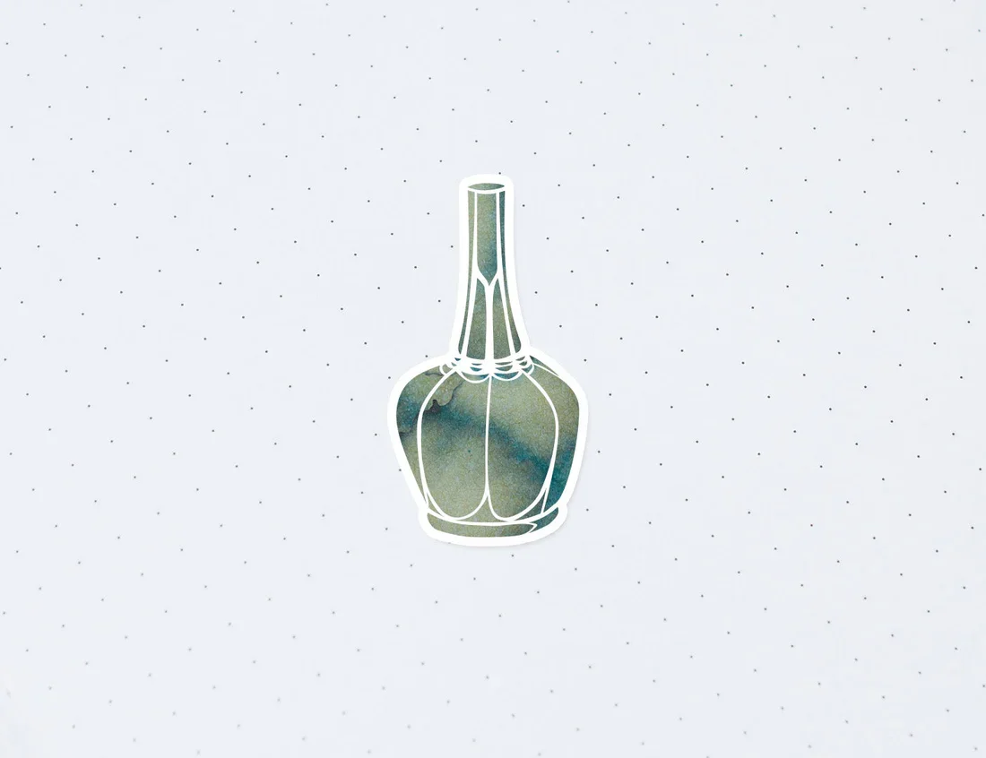
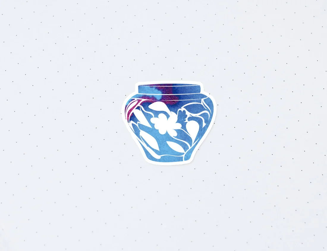
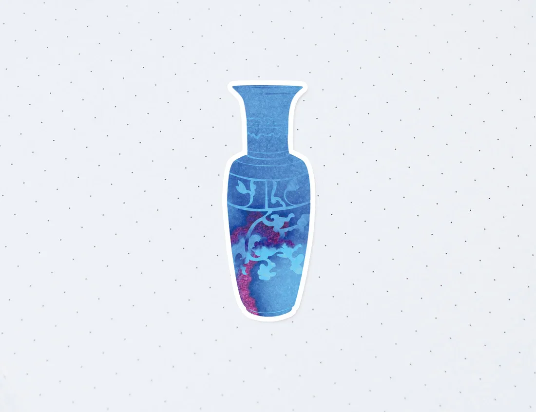
Yoseka requested stickers to be made for each ceramic piece. These stickers were made available for individual purchase so that customers who might not want to buy a full bottle of fountain pen ink can still support the project.