Yoseka x TRAVELER'S - Home Refill
an exclusive notebook insert designed in collaboration with TRAVELER'S COMPANY — all concept, design, mockups, and photography by Ashley Womack unless otherwise stated
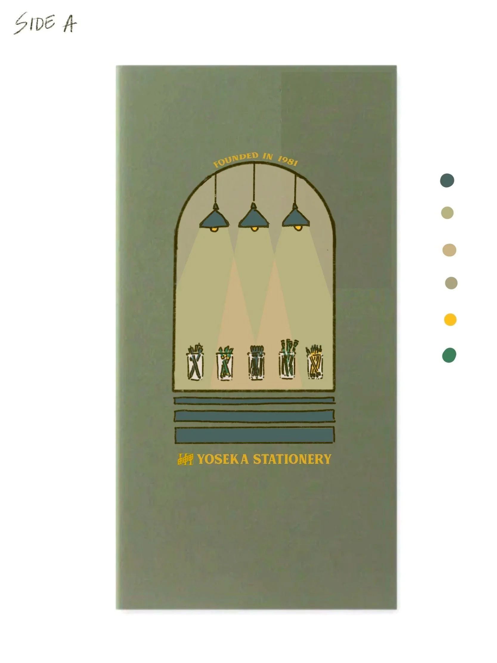
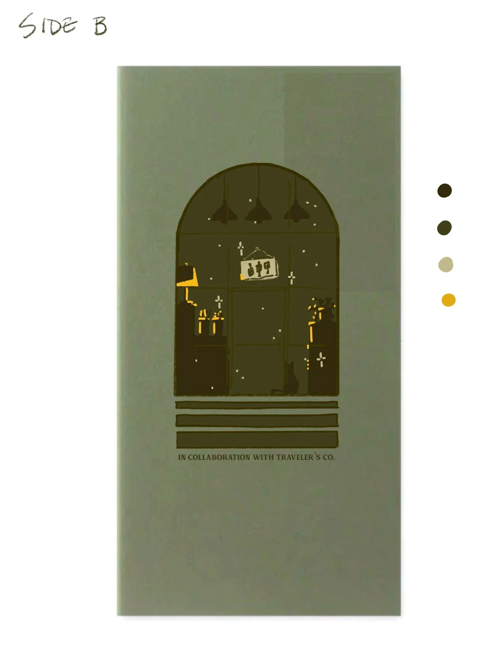
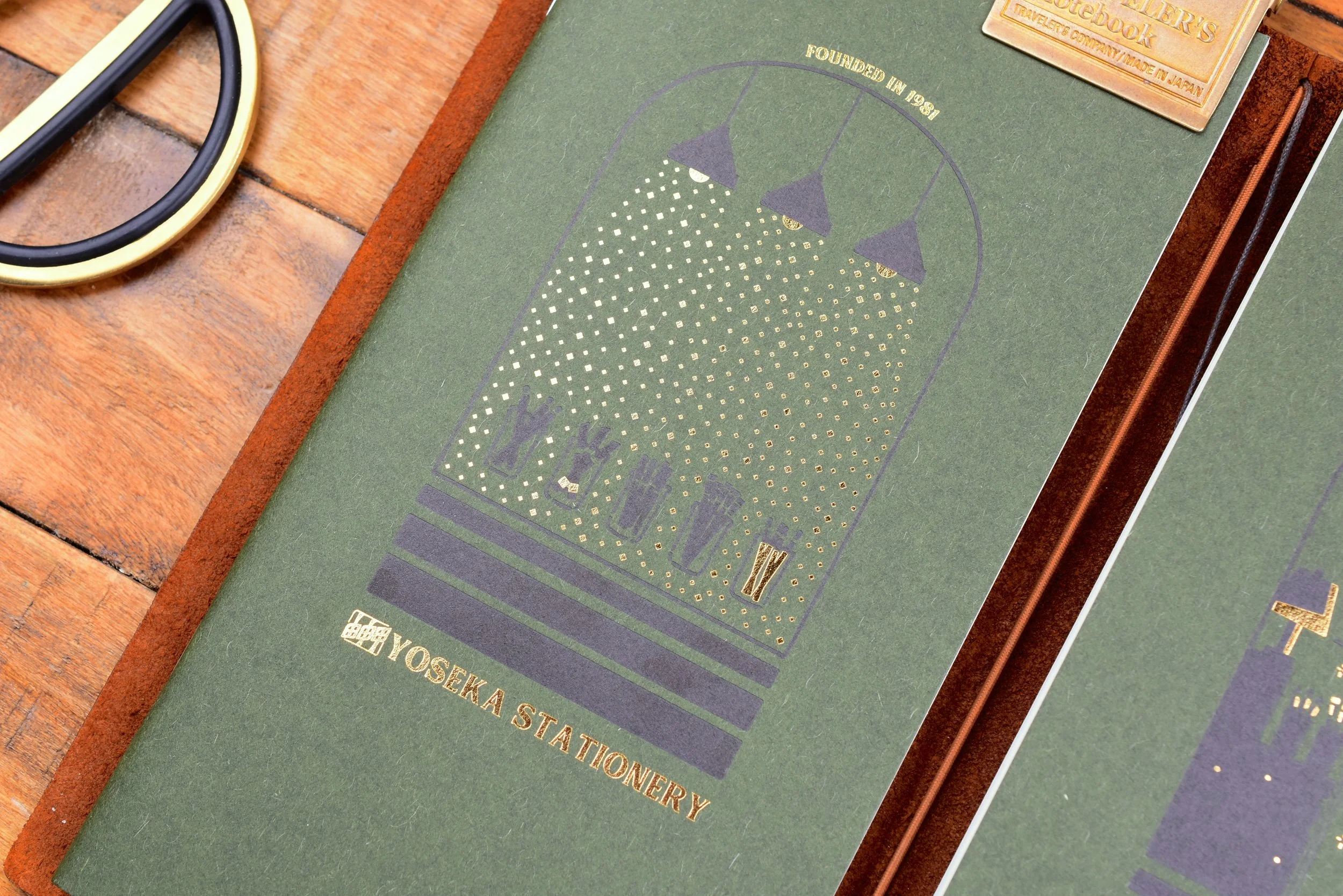
Final Product: Letterpress and gold foil printed by TRAVELER’s on front and back, saddle (staple) binding, Tomoe River Paper interior
BACKGROUND INFO
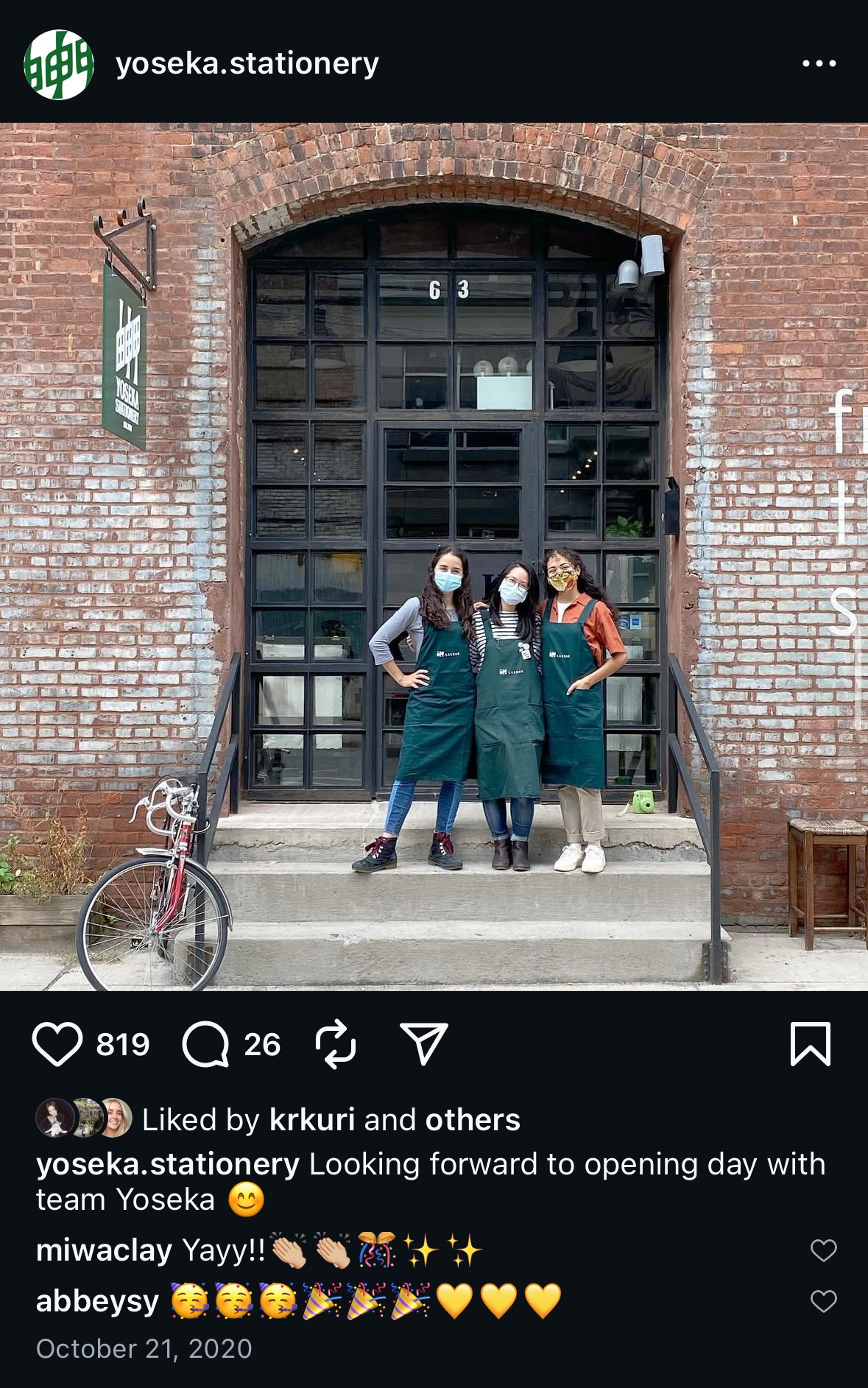
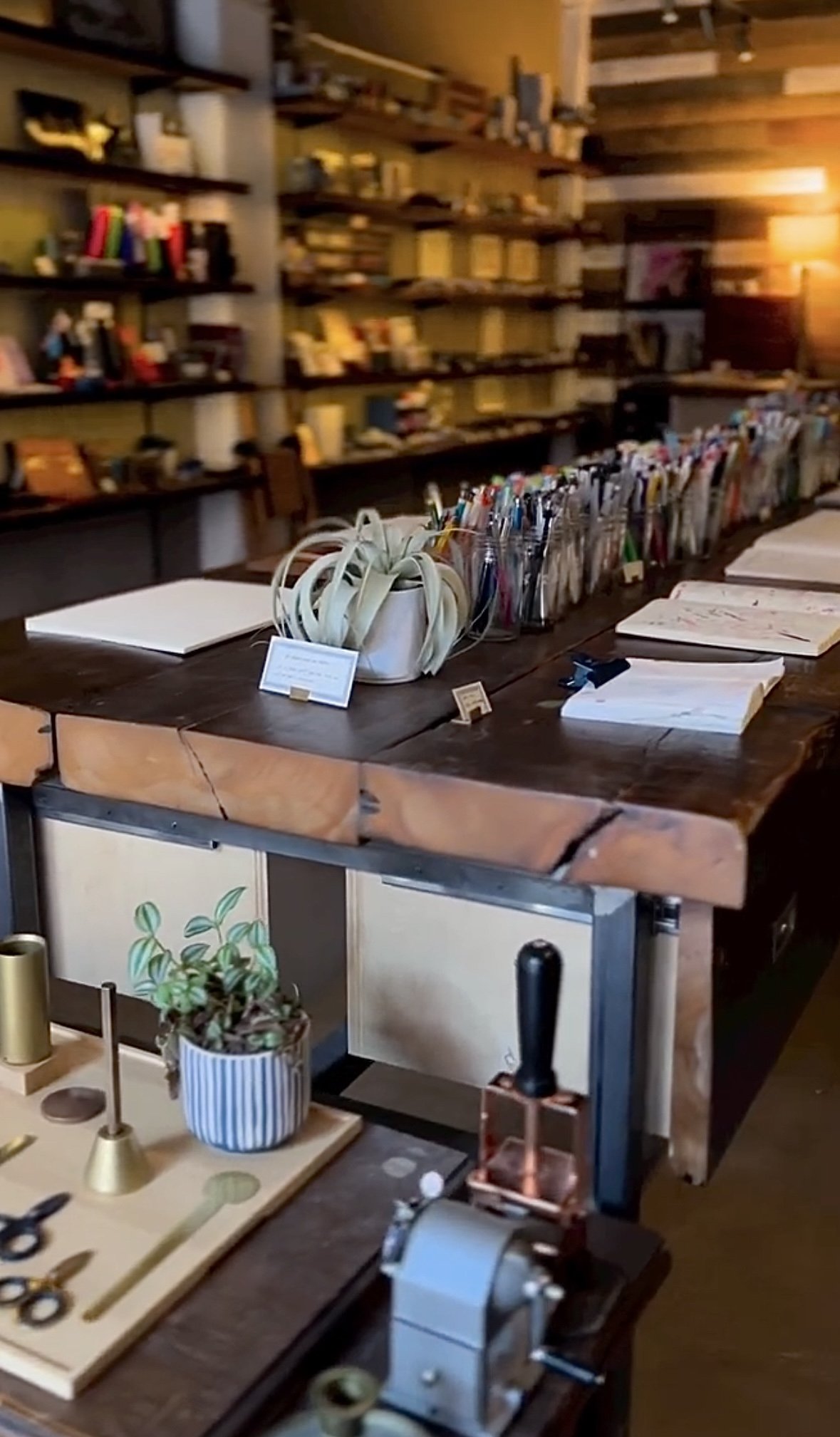
Yoseka Stationery is an Asian stationery store located in Greenpoint, New York. They carry various brands of notebooks, fountain pens, inks, markers, stickers, and general desktop goods that are popular in Japan, but have a growing global audience. In 2020, Yoseka became a TRAVELER’S Partner Shop and, the owners of the shop desired to create a product that could be enjoyed and used by both the TRAVELER’s and Yoseka audience.
CONCEPT, RESEARCH, & IDEATION
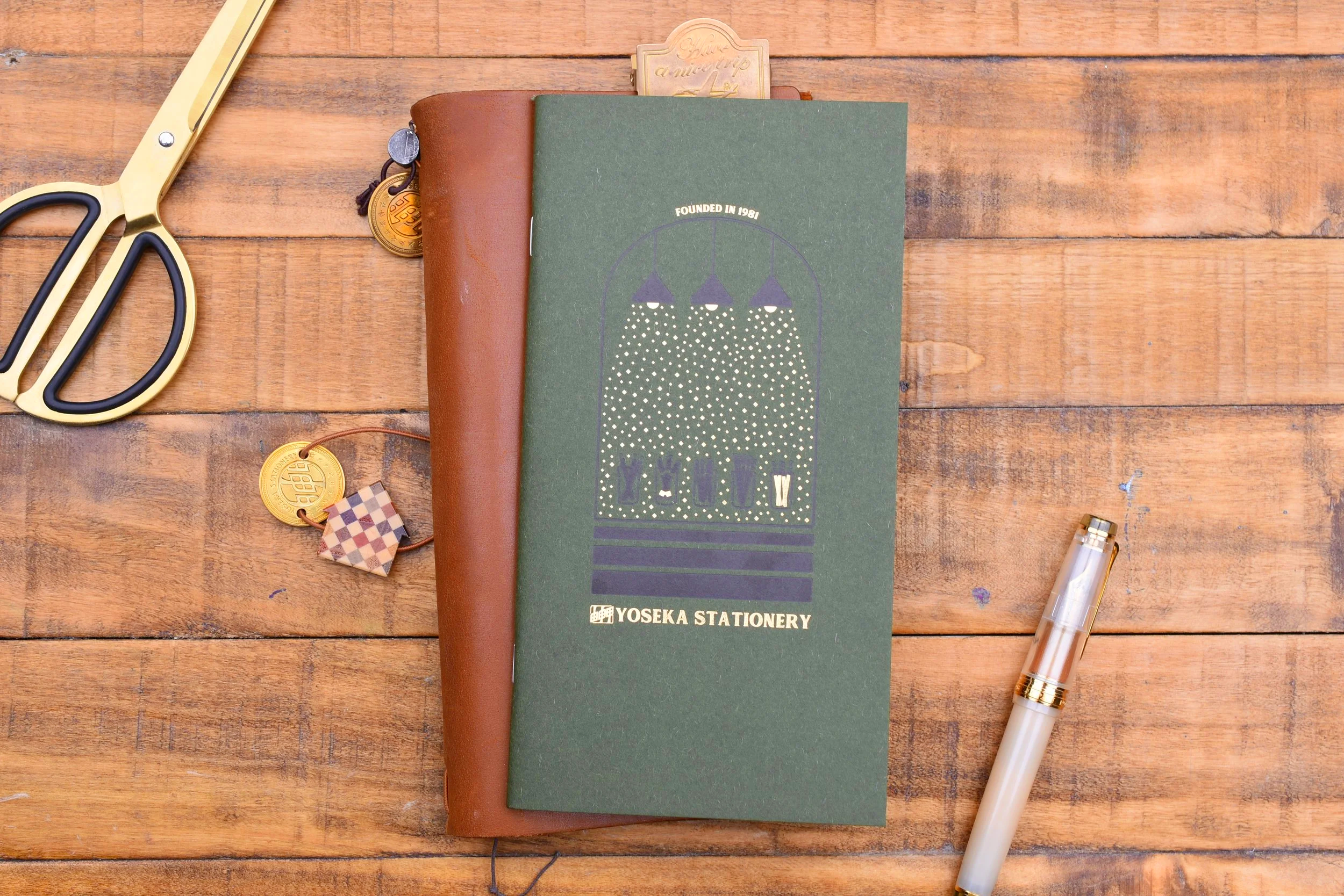
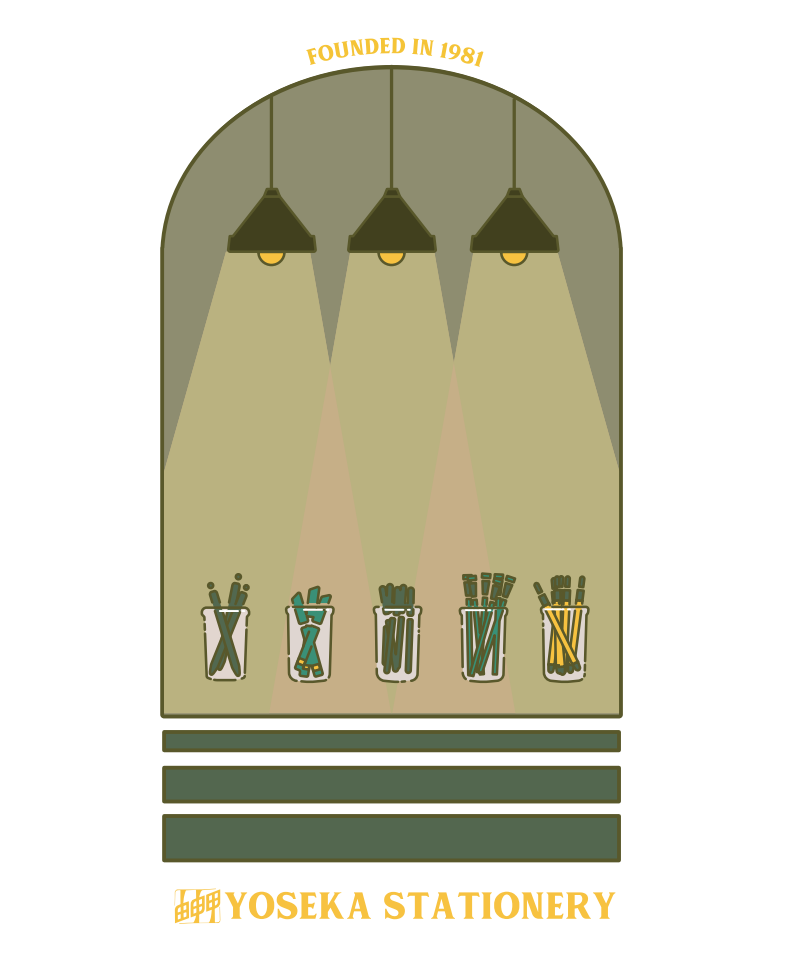
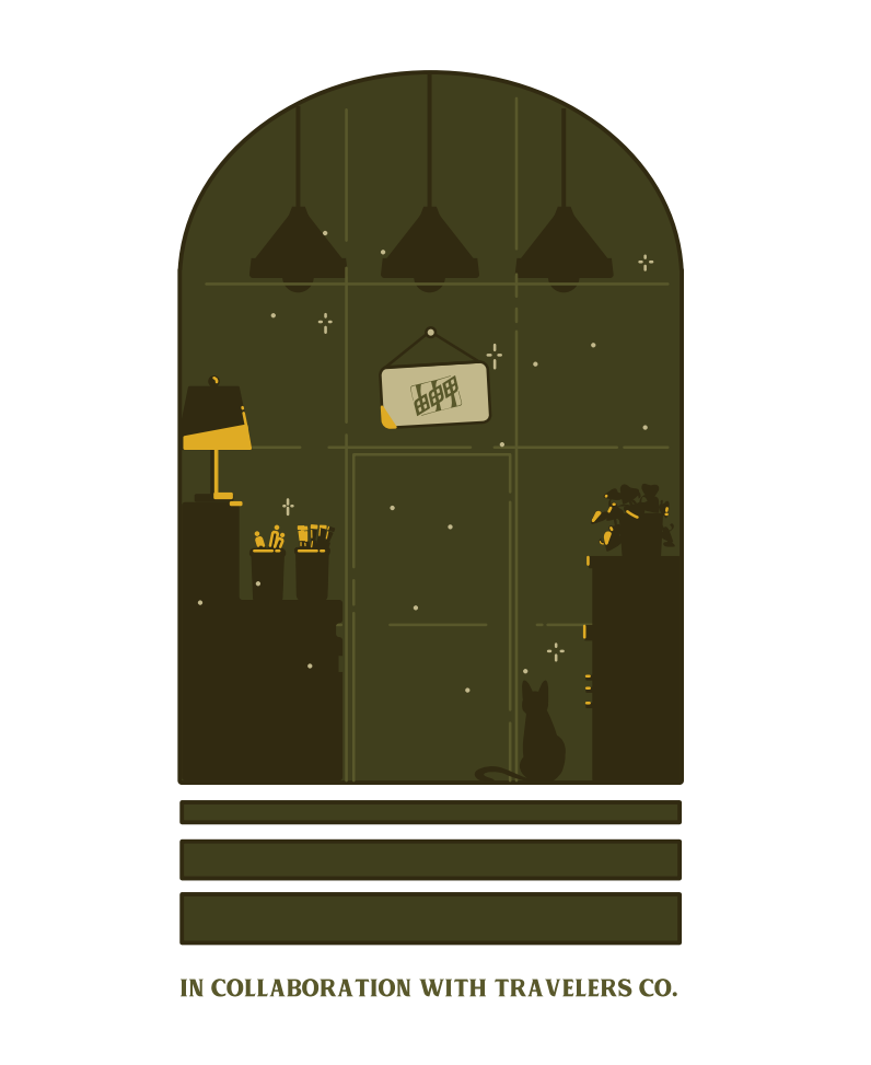
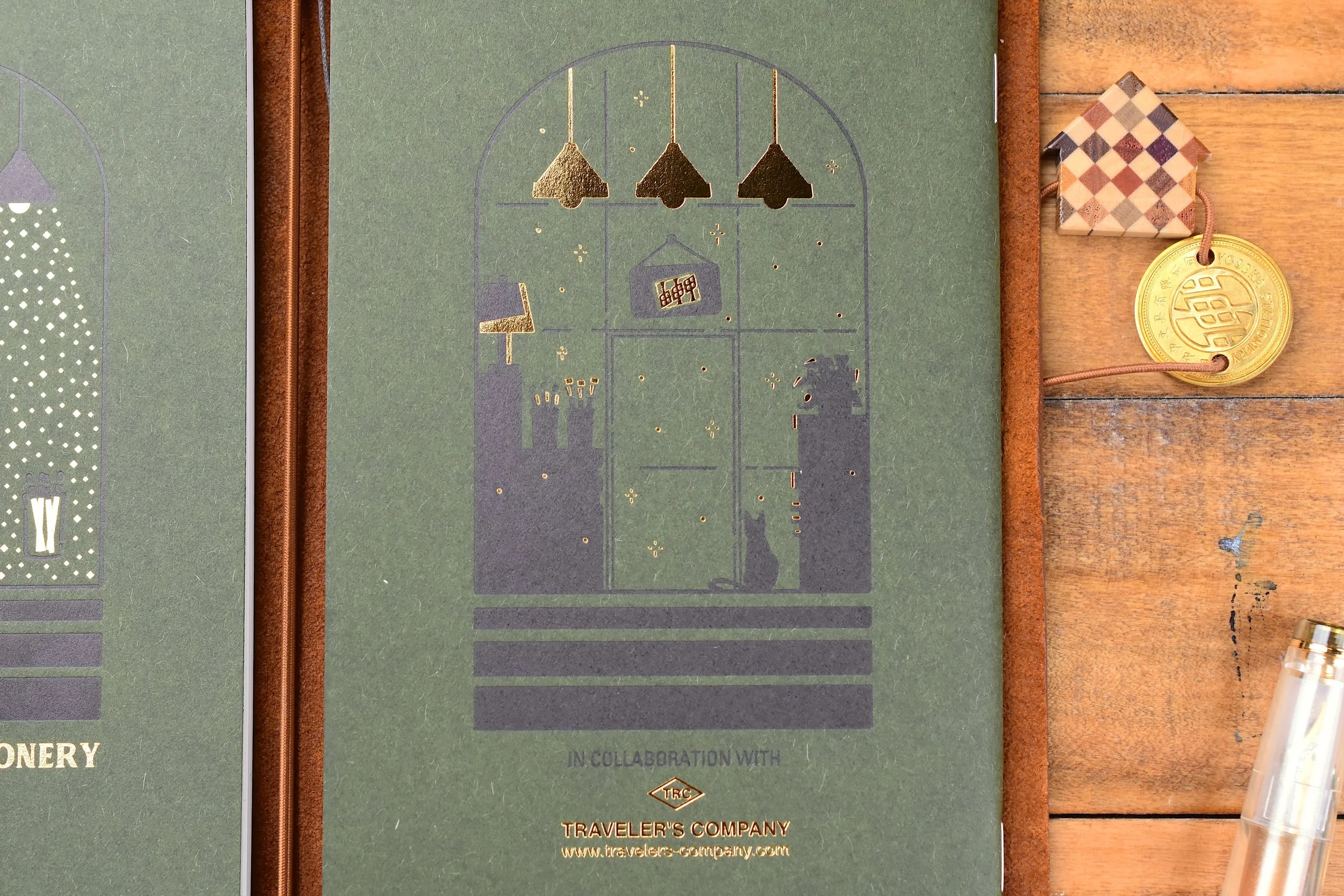
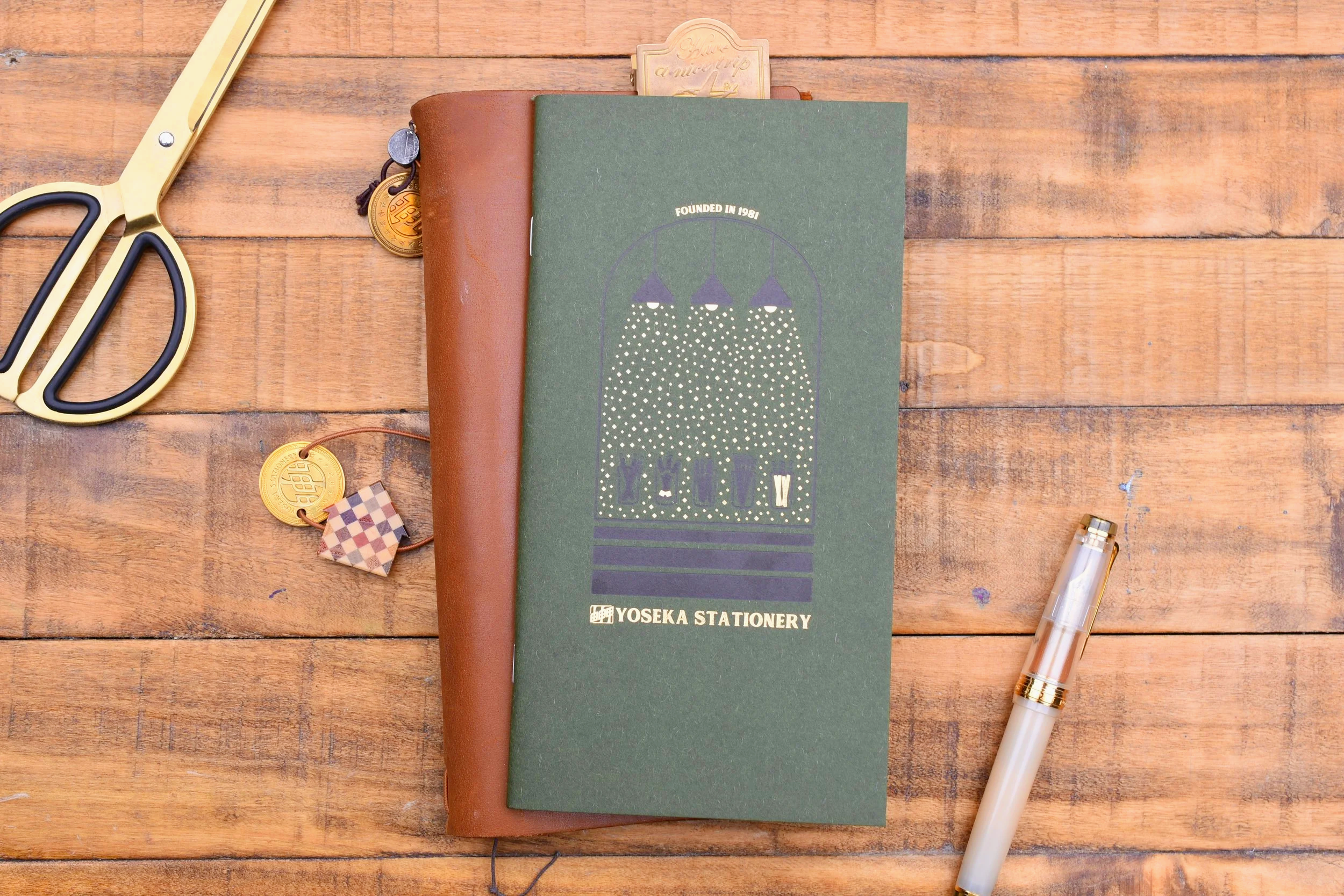
Inspiration was taken from the store’s unique front door shape and shopping experience. I wanted to highlight how customers are able to test pens on the main table after entering the space, as this is how the shoppers spend the majority of their time in the store. The interior is filled with unique lighting fixtures, and they become more prominent when the shop closes. These light fixtures are left on overnight, and the dim light is eye-catching within the arched entryway, elevated by three steps.


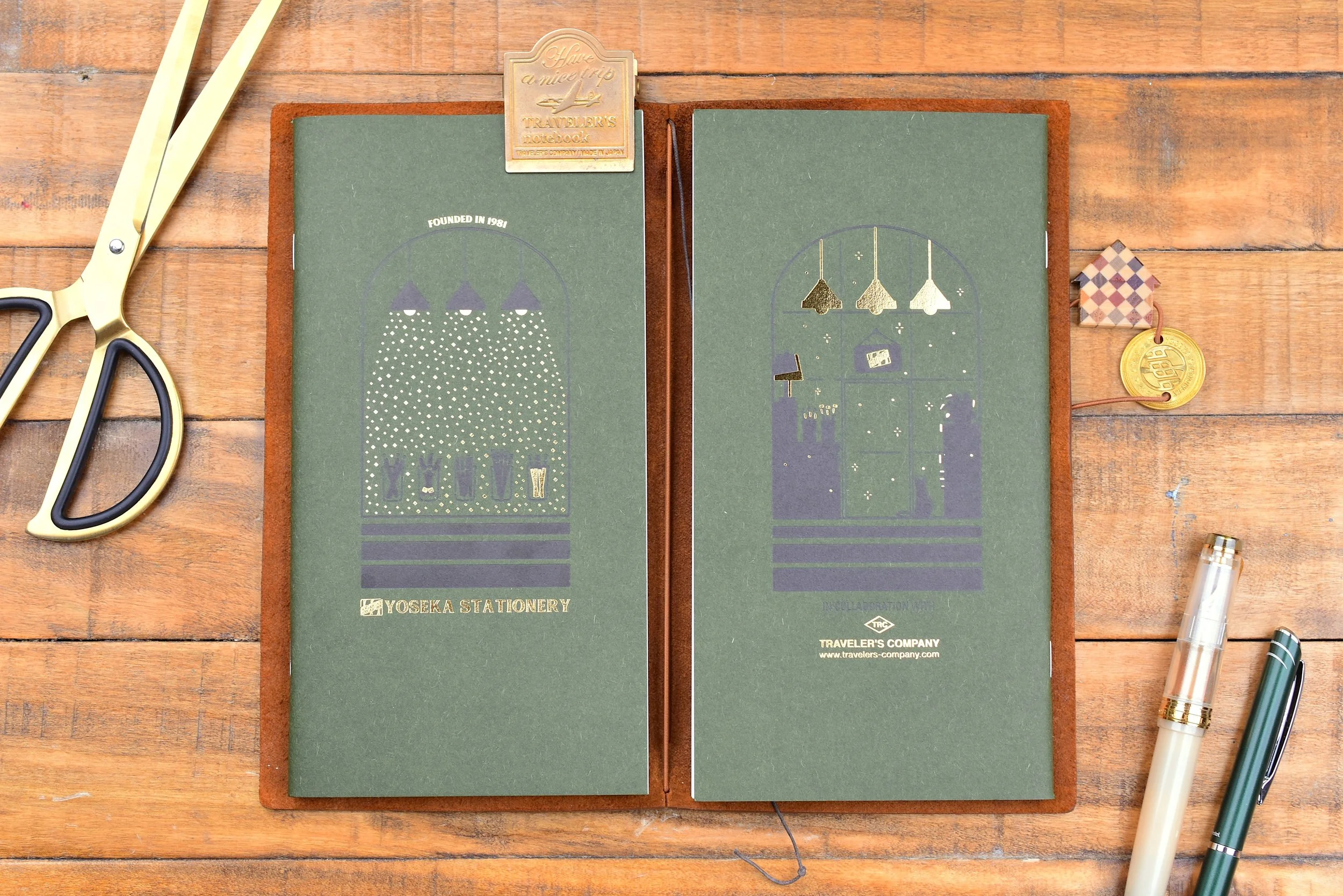
The final concept I sketched depicts the shop open during the day on the front cover, and the shop closed during the night on the back cover. I simplified the elements of the shop enough for printing, while retaining unique points of the shop so that that the imagery can’t easily be mistaken for another store.
VECTORIZING
To format the digital illustration for scalable high-quality printing, I created a simplified vector design using Adobe Illustrator.
SOLVING PRODUCTION CHALLENGES
TRAVELER’s COMPANY suggested we simplify the number of colors used in the print. Due to the way the letterpress machine prints the colors, too many could lead to unwanted misalignment or overlapping colors. We decided to simplify the letterpress print to one color silhouette, with gold foil accents to make up for the lack in color. TRAVELER’s designer took over the process at this point and helped me format the design for their gold foil printers.
FINAL FEATURE SPECS & SELECTIONS
The color of the paper background was selected by the owners of Yoseka to match the green color of the shop’s branding. While the black letterpress printing has less contrast with this background than I would have liked, the gold foil pops on the dark background.
PRODUCT PHOTOGRAPHY
I staged and photographed the Yoseka Home Refill with other matching items from the collection that I designed, such as the brass Lucky Token and the Home Fountain Pen. Utilizing gold items in the photos helped to bring the unusually dark print together with the other lighter items in the collection. In addition to photography, I also filmed and edited a promotional short-form and long-form video for the brand to post on their account.
PRODUCT RECEPTION & SALES
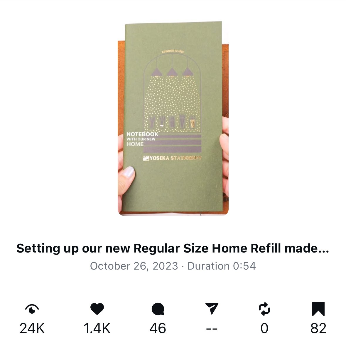
After launch, the first run of 1,000 Yoseka x TRAVELER’s Home Refills sold out within a few days. Since then, the notebook insert has had 3 more runs, with sales of 4,000+ units. It has become one of the most coveted designs for a TRAVELER’s refill within the stationery community, and continues to be the best selling Yoseka Stationery collaboration item in their shop.